(11/23/20) Covid-19 continues its seasonable acceleration reaching exponential growth much like its first wave in March. The U.S. is showing a bimodal pandemic where states with least restrictions have uncontrollable outbreaks and those with most restrictions are far milder. Sadly, this bimodality correlates with gubernatorial politics.
Snapshot
Here again is a dashboard view of Tables of per capita cumulative deaths and weekly death rates as indicators of total magnitude and current severity, respectively, for the Covid-19 epidemic in various populations locally and internationally. The death rates of Belgium, Italy, France and the U.K have jumped at least four-fold since our last update just a month ago. The U.S. and Spain have more than doubled. Domestically, MI has more than tripled and TX and AZ have about doubled in the last month. Later we show that these are not the worst states by far. Stateside LA death rate is up 50%, but OC and CA have declined over the last month. But ….
Cumulative death and death rate data for select populations around the world (as of 11/20/20).
Here are the latest death rate plots for the U.S. and CA.
Daily death rate data for the U.S. and CA.
The main observations are:
The U.S. is surging and showing exponential growth again, frighteningly similar to the original outbreak that started in March.
Also frightening is that Europe is about a factor of 2 worse than the U.S.
CA for all the fear and loathing and new restrictions imposed is far better than most states in the U.S. However, this is not time for complacency as cases and hospitalizations are swelling again and we are probably only lagging the seasonal surge due to warmer weather.
The deadliest states in the U.S. are ND, SD, WY, NE, WI, MN, IA, MN, KS, IN all with greater than 50 weekly deaths per M population, which is more than the states listed above and comparable to Europe (more coverage below).
Around the world, the currently deadliest region is Europe. Inexplicably Brazil has noticeably dropped in death rate. The rest of Latin American has also turned a corner suggesting that a seasonal effect is real.
The Local Scene
Below are hospitalization and death rate plots for Los Angeles County (LAC) and Orange County (OC).
Cases, hospitalization and death rate plots for Los Angeles County (LAC).Cases, hospitalizations and death rate for Orange County (OC).
These are good examples of what are leading vs. lagging indicators. As you know, I have not been a fan of case statistics because in the early days they were vastly understated because of the lack of testing. Testing may still be at inadequate levels but at least they are administered fairly stably so I expect the relative trends to be informative. In the pecking order then, case incidences are leading indicators followed by hospitalizations and then deaths. These trends are clearly seen in the plots for both LAC and OC. Cases are soaring exponentially, which is horrifying if not reversed immediately. This rise is starting to show in the hospitalization rates also increasing exponentially and now we are seeing the first hint of the death rate increasing commensurately. Where this goes is hard to predict. However, Governor Newsom is right to invoke restrictions now rather than wait a couple of weeks when it might be too late to reverse the trend.
At least the trends are now making sense. For nearly two months, as we discussed in previous postings, the statistics for OC were bizarre where hospitalizations were declining but death rates were staying high and even surging. We posed some postulates, but I now think it was due to reporting anomalies whereby death reporting was playing catchup and the surges were not real but just clustering of data. Evidence of a return to normal reporting is that the percentage of hospitalizations that lead to death has come back down to about 2% for all hospitalized patients and about 6-8% for ICU patients and this percentage applies to LAC as well.
Death rate vs. hospitalizations for LAC and OC
I finally mention that I now commend people in OC who months ago were resistant to wearing masks but are now nearly all wearing masks around town and in places of business. Keep it up!
The Nation
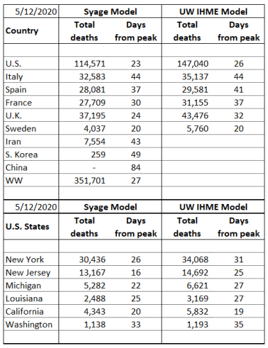
The death toll in the U.S. now stands at greater than 250,000. Arguably the most widely accepted Covid-19 forecasting model is that from the Institute for Health Metrics and Evaluation (IHME) at the University of Washington (https://covid19.healthdata.org/united-states-of-america?view=daily-deaths&tab=trend). (Recall in the early days that my forecasting model was shown to be somewhat superior to this one, but over time a team of 10 beats my part-time efforts). IHME forecasts that by March 1 the total U.S. death count will be 471,000 based on current government mandates for social interventions. If only mask mandates were universally implemented that number goes down to 406,000. That is 65,000 future deaths could be avoided by governments and people rising above politics and selfishness and just mandating masks!
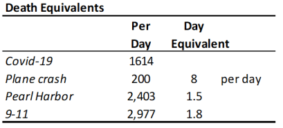
Below is a death equivalent Table that if it does not shock people to reason then probably nothing will. This shows that the current daily Covid-19 death rate is equivalent to 8 plane crashes a day. Can you imagine if there really were 8 plane crashes a day? No one would ever fly on a plane! So why are we so cavalier and careless about Covid-19? Humans can be very irrational. Just to punctuate the atrocity of this pandemic, the daily death rate is equivalent to a Pearl Harbor every day and a half and a 9-11 about every two days.
So, above I showed the benchmark states that I use to get a snapshot of how the states are doing. Well in fact now none of them are in the top 12 hottest states. Those are listed below along with CA for comparison. And in case you are fuzzy on where in the country they are, just look at the map below and figure out which two states are not on the top 12 table (CO and MO are 14 and 17)! In fact, a new infection happens faster than you can say Sturgis Dakota Motorcycle Rally! That’s right that hedonistic, selfish event is responsible for 260,000 Covid-19 infections (as of 9/9/20) and counting (https://khn.org/morning-breakout/sturgis-biker-rally-linked-to-260000-covid-cases/). These 12 states account for 39,000 Covid-19 deaths. If we reasonably attribute half of these to the Sturgis rally then it begs the question: is a Covid-19 death a fair trade for every 20 bikers enjoying a week of drunken debauchery? Here’s another one for you. News articles in the NY Times and LA Times reported on a Stanford study that stated that 18 Trump campaign “events are connected to 30,000 infections and 700 COVID-19 deaths …”
In case you didn’t notice the Dakota’s are experiencing over 140 weekly deaths per million population. This is the highest death rate in the world. By comparison the worldwide average is 9 and CA is at 11 (more than 10x less deadly per capita). Yet South Dakota Gov. Kristi Noem reiterated in a tweet last week, “We already know that lockdowns DON’T stop the spread of the virus.” So, no mask mandates, no nothing, just 150 more caskets every week in a population less than a million.
The NY Times also plotted these states for number of cases and deaths vs. degree of control measures and to no surprise it follows a diagonal line with fewest controls corresponding to greatest Covid-19 outbreaks and tightest controls to least. Since I am on a good rage now, I assert that these politicians (starting at the top) are treating American lives as pawns for their own self interests. This makes their actions or lack of them more hideous than the most vicious mass murderers in history. Why do we Americans allow this to happen!
International
The situation is dire around the world and particularly in Europe. After taking Herculean measures to curb the pandemic when it first hit exponential growth in March and astoundingly knocking it down it is sad to see this recur on a population that is utterly fatigued by Covid-19. I won’t provide the commentary above because I am less familiar with government interventions overseas other than to note that it is taken far more seriously there than here. The Figures below highlight some of these countries.
Death rate plots for select countries and for worldwide.
Some main observations include:
France, Italy and Belgium in less than a month have accelerated to nearly their previous death rate levels.
Sweden has renounced its previous lax strategy and is implementing strong social intervention.
Brazil has actually declined, no thanks to President Bolsonaro. This means either that Brazil is reaching herd immunity or a seasonal effect is making the virus less infectious, probably a combination of both.
I haven’t done a Daily Rumblings in awhile so will start afresh with a new one. As a reminder these are for shorter late breaking or hot news. I will continue with my longer numbered posts so stay tune for those.
11/3/20
Happy Election Day. Now for some contemporary and I think poignant commentary.
Halloween
Halloween is one of my favorite holidays and I love to goof with the kids who come around. I’m always in some costume. This year we didn’t know what would happen and we didn’t think it was a good idea for families to go romping around neighborhoods, but we were prepared by sitting back and putting the candy out front for the kids to pick from and keeping our distance. We didn’t get a lot of treaters so we walked around a bit. We were happy to see families and kids going around, but there was a disturbing pattern to it. Out of about 8-10 or so families that we saw, in only one were the parents wearing masks. Forget about the kids wearing one. Two families carried an American Flag. I can’t help thinking we got punked by the anti-maskers and they were toying with us in our neighborhood, particularly since it seemed like most of the families came in some car. This realization caused our joyfulness to fade and our contempt to rise when their rebellion would walk up our sidewalk. Hoping for better next year.
Cases, deaths from Trump events
News articles in the NY Times and LA Times reported on a Stanford study that stated that 18 Trump “events are connected to 30,000 infections and 700 COVID-19 deaths …”
This is beyond alarming. Not sure you know that ND and SD are the two most prolific states for cases and deaths per capita. Now what was that motorcycle rally that descended on Sturgis for 10 days in August drawing almost a half million participants? And this wave has penetrated the mid western and central states as well.
So, being a little skeptical I downloaded the Stanford paper (https://papers.ssrn.com/sol3/papers.cfm?abstract_id=3722299). Sure enough it is laden with approximations, but their transmission model looks solid and scientifically sound. What was surprising is that they then did a placebo analysis, where they replicated similar environments and populations that didn’t have such events. Magnificent, even if there are never perfect placebos in this type of analyses, but still it is essential for meaningful results. At least you can attach some statistical probability to the results. In the discussion they state “… examining the experience of a few counties which, according to the preceding statistical analysis, were highly impacted by Trump rallies.” How bad? They are trying very hard not to be controversial. Best to just state verbatim the conclusion:
“For the vast majority of these variants, our estimate of the average treatment effect across the eighteen events implies that they increased subsequent confirmed cases of COVID-19 by more than 250 per 100,000 residents. Extrapolating this figure to the entire sample, we conclude that these eighteen rallies ultimately resulted in more than 30,000 incremental confirmed cases of COVID-19. Applying county-specific post-event death rates, we conclude that the rallies likely led to more than 700 deaths (not necessarily among attendees).”
More distressing is that this is just the beginning of the proliferation from these super-spreader events meaning there could be many more deaths as time goes on. So is a rally really worth 50-100 deaths?
Antibody testing in Orange County indicates high number of Infections
The antibody test probes for individuals who have been previously infected and are therefore presumably immune. The results showed a staggeringly high level of infections in OC being 11.5% of the population having had COVID-19. This level was even greater in Latino and low-income neighborhoods at 17% and 15%, respectively.
Let’s look at how this measurement compares to expectations based on deaths and mortality rate. Given about 500 deaths per million in OC and say a 1.0% mortality rate, we calculate 5% total infection [500 / (.005×1,000,000)]. The higher measured rates means that COVID-19 is very contagious and prevalent, but that the death rate is now much less than the 1% that characterized the early pandemic. This is consistent with infection rates infiltrating younger less fatal populations. The important take home is that deaths are concentrated in the elderly and infections are concentrated in the younger. Youths need to understand that they are now responsible for inflicting most of the COVID-19 deaths. I wonder how many of them are seeing a direct association of their infection to older family members dying. It can’t be insignificant.
8/28/20
The Corruption of our National Health Services
I try to avoid politics in my commentary, but unfortunately politics sometimes inserts itself in the most dreadful ways and when it endangers the lives of Americans in order to support crass self-interests, I’m going to speak out. I have been challenged by readers for being political, but I believe I hold all guilty parties accountable for their actions or lack of them from conservatives (the Administration, the mask-averse southern outbreak states) to liberals (most media, California, millennials, etc.). It is about the search for the truth and identifying and solving problems.
In just two days the Administration has twice asserted its dictatorial mandate on two of the most respected and vital independent departments of the government, the FDA and CDC both of which reside under the Department of Health and Human Services (HHS). HHS is headed by Trump designate Secretary Alex Azar, a member of the Cabinet and supposedly our nation’s leading health care expert who by the way has no experience in health care and is the first non-scientist or medical professional to hold that position, being a lawyer from the pharma industry. And by the way he is the 4th person in that position under our President. But I digress.
First, the Administration rammed an FDA Emergency Use Authorization (EUA) for convalescent plasma and forced FDA Commissioner Stephen Hahn to falsely voice the Administrations claim that it reduces mortality by 35%. Hahn was severely rebuked by the medical profession and has irreparably damaged the FDA’s and his reputation for truthfulness and impartiality. So here’s what’s known. Based on the largest trial to date by the Mayo Clinic, there is no evidence of reduced mortality as this and no trials have been conducted with a placebo control. Instead the data indicate that the 7-day mortality rate ranged from 8.9% to 13.7% for high to low doses of plasma, respectively. The misquoted 35% figure is a relative number and comes from the difference between these percentages [(13.7-8.9)/13.7 = 35%], which is a meaningless comparison without a placebo control and barely showed statistical significance (p=0.048). The 30-day mortality data were even less significant. Totally deceptive reporting by the Administration and FDA. The best estimates for absolute reduction of mortality by plasma infusion are about 3.5%. Worth doing in certain sub-populations, but hardly a breakthrough.
Remember the FDA was also forced to give EUA status to hydroxychloroquine, which the FDA then had to revoke when evidence showed it was more harmful than helpful.
Second, the Administration continues to sabotage coronavirus testing in a fully-admitted effort to suppress the number of cases because it makes the Administration look bad. Now the CDC has changed their guideline to say testing is only required for symptomatic people. The New York Times and CNN quoted CDC officials that the change was “forced down” from the Administration. The majority of transmissions are now from asymptomatic patients, so dah! Yes, we need to test people who are known to have been exposed! Fortunately, most states are ignoring the new CDC guidelines. CDC Director Robert Redfield, whose reputation is already in shambles, had to walk back his comments after a huge backlash by adding that “those who come in close contact with a confirmed or probable COVID-19 patient could be tested.” Could be?!!! This kind of muddled double-speak and ambiguous advice just further confuses the public.
Testing rates, however, are increasing in the U.S. and per capita we are behind only a couple of dozen countries such as Russia, Bahrain, Israel, UAE, U.K., Singapore, Australia, Denmark, Luxembourg, Lithuania, Iceland, Malta, Cyprus, Cayman Islands, Bermuda, Gibraltar. Granted some of these are small countries, but I left off even smaller ones whose testing rates exceed the U.S.
Is Herd Immunity Already Helping?
In my recent post (23. Biweekly Update: The U.S. has Given Up) I noted that countries (e.g., Italy, Spain, France, U.K. Belgium) and U.S. states (e.g., NY, NJ, MI, New England) that had the worst outbreaks have effectively recovered and are holding down the virus. Is this due to having witnessed decimation of lives and health and continuing to have a fear factor about opening up or is there perhaps another contributing factor? I believe both.
There is much discussion about how much herd immunity is needed to tamp down Covid-19. Generally, it is acknowledged that herd immunity of about 60% would slow and eventually eliminate cases and deaths. This comes about because the reproduction number R0, number of people an infected person will then infect, is about 2.5. This is for a population that is 100% susceptible. However, at 60% herd immunity, the susceptible population is 40% and that gives an effective R0 (Re) of 1.0, which is the point where the infection rate stays constant. Re must drop below 1 for infections to decline. We can model this with the following equation:
Re = R0 x (1-P) x (1-T)
where Re is the effective reproduction number, R0 is the basic reproduction number, P is the percentage who were previously infected (herd immunity factor) and T is the reduction in transmission rate due to social distancing and caution. If R0 is say 2.5, then either herd immunity of 60% or reduction in transmission of 60% gets Re down to 1 and the spread doesn’t grow. A combination of both helps even more.
If 3/5 of all people (60%) become immune then R0 = 1.0 without any social distancing. But say we can do 40% social distancing and get R0 down to 1.5 then only 33% herd immunity would be required to get down to R0 = 1. So, they act together and all immunity helps. NY, NJ and New England are indeed at about 33% herd immunity, so just modest social distancing will keep infections down. I believe that the level of herd immunity in other hot spot populations of the world is sufficient to make it easier to reduce infections with modest social precautions.
A quick way to get a decent approximation of the fraction of the country that has been infected is given by:
(total deaths) / [(IFR) x (population)]
Where IFR is the infection fatality rate. As an example, for Spain we have total deaths = 29,000, population = 46,755,000. So, for an IFR = 1% one gets 6.2% for herd immunity, which is close to what is reported by antibody tests, though these tests have large uncertainties. However, new evidence is that infection is far greater due to asymptomatic patients so this could easily be >10%. We expect similar amounts of herd immunity in other European countries offering some, but not a lot of protection.
Re-infections
Fortunately, SARS-CoV-2 mutates slowly and therefore immunity from a vaccine or infection should be relatively long-lasting. This is unlike the flu virus which mutates rapidly requiring annual vaccination. At the other end of the spectrum are measles, mumps, rubella for which, though also RNA viruses, vaccinations can last a lifetime due to slow mutation.
As for re-infections the jury is still out. My hunch is that this is due to the person not actually having been infected the first time. The Covid-19 test has a 4-5% false positive rate, which means 4-5% of people who take the test register positive when they are really negative. So, if they then get it later it appears to be a re-infection, but is not. This needs to be looked at closer. There has been one verifiable second infection:
However, is this something to be worried about? Let’s consider some statistics:
Probability of getting Covid-19 once: (70M cases over 7B population = 1%)
Probability of getting Covid-19 twice: (1 case over 70M cases = 0.000001%) at least so far.
There have been reports about antibody levels declining with time giving concern for how long one remains immune. Well it is normal for antibody levels to decline after initial infection, but they are still at adequate levels. This initial surge followed by relaxation to an ambient level is typical of viral infections. After 3 months there are still sufficient defenses to maintain immunity. Let’s thank our memory T-cells.
8/3/20
California Update
I always proselytized that the only reliable data there is on Covid-19 is deaths. Hard to ignore or miscount those. However, deaths are a lagging indicator by 2-3 weeks on new cases and how things are doing in the present. In the past I totally ignored new cases (incidences) and total cases (prevalence) because they were grossly understated due to inadequate testing. Instead I calculated them from the death rates and marched back 2-3 weeks, then forecast forward based on the shape of the curve. Still do that. Now if the inadequacy of testing was at least constant then the trends in cases would have been useful, but this was distorted as testing frequency increased. Now it is fairly constant so trends in cases is an improved indicator. However, over the last couple of months I have started using hospitalizations as an earlier indicator because if you are sick enough to go to the hospital, despite whether you were tested, that means something and then you do get tested. And indeed, it is working out to be a pretty good predictor.
In my 7/22/20 Biweekly Update (Post 22) I showed plots of hospitalizations and death rates for LA and OC and noted where you could see death surges a week or two following hospitalization surges. However, it was also true that the latest hospitalization surge didn’t seem to show a corresponding increase in death rate, but it was expected. Now two weeks later the latest surge in death rate is quite evident as seen in the Figures below. However, the good news is that hospitalizations are falling and therefore we might predict a commensurate decrease in the death rate over the next couple of weeks. Hopefully we are seeing a sustained trend toward decreasing rates of infections.
(Left) Hospitalizations and (Right) death rates for Los Angeles county as of 8/1/20.(Left) Hospitalizations and (Right) death rates for Orange county as of 8/1/20.
The Figures below show the death rates for the state of CA and for the U.S. Both populations have undergone a relapse from their peaks in late April. The CA surge is due primarily to the growth in cases and deaths in LA and especially OC. The surge in the U.S. is due to late comer outbreaks, e.g., FL, TX, AZ, and the relapser CA as discussed in previous postings.
Death rate for CA and U.S. as of 8/2/20.
Finally let’s look at growth in death rates and deaths per capita for CA counties and then compare that to the rest of the country and the world. A Table is given below. Numbers speak louder than words.
Death rate statistics for 9 most populous counties in CA and other populations for comparison
Here are some observations:
CA death toll grew 411% over the last 3 months though its level of 241 deaths/million still pales relative to the worst hotspots in the country and world. Still it is heading up faster than these other populations.
For comparison, the new hotspot states are also marching up rapidly in deaths per million: AZ (519), GA (362), SC (348), FL (333), TX (257).
OC has gone from the lowest to the 3rd highest per capita death toll of the 9 most populous counties in CA. Its growth over the last 3 months of 1,315% rivals that of Brazil.
If you dig further at the OC statistics one finds that North County accounts for about 90% of all OC deaths and that Anaheim and Santa Ana represent 51% of the 651 total deaths probably due to having a heavy preponderance of nursing homes.
Santa Clara, where the CA scare first started, now has a death toll that grew only 72% over the last 3 months. Commendable, but word is that this county is starting to see case counts rising dramatically, so the message is there is no rest for the weary. Everyone is susceptible. Be careful.
More Musings
Will Hurricane Isaias be good news for the U.S. southeast coast if it keeps people in their houses for a couple of days and reduces infections? We’ll know if there is a dip in hospitalizations and deaths over the next few weeks.
I have never seen so much traffic in OC, just gridlock in the coastal cities. I know people are going somewhere, but maybe the more time they spend in their cars the less time they spend getting infected.
Why should we doubt that kids are immune and non-infectious to Covid-19. After all they never get any other virus flus or colds at school and bring them home to infect their families.
The hope that the corona virus would be seasonal like other flu viruses seems not to be. The U.S. southern states are having major outbreaks and they are not called hotspots just because of Covid-19.
7/9/20
What Me Worry!
There seem to be Alfred E. Neuman’s running around all the governor’s mansions, which is driving people MAD. The figure below is quite astonishing.
Hard to believe that AZ, FL, and SC have the fastest growing rates of confirmed coronavirus cases in the world on a per capita basis (the only way to make comparisons). In fact, there are 16 U.S. states in the top 26 outbreak regions in the world. This is not the way to rev up the economy by turning it off and on and off in fits and starts.
Now I have tried to stay apolitical throughout my blogging, resorting to facts and data and (semi-)dispassionate commentary. And I hope to remain that way, but I will let you form your own opinion on these facts:
Every state in the figure above except NV and CA were Trump states in 2016. That is 14 of 16 and of those 14 all but two still have Republican governors.
Of the 28 Trump states in 2016, 24 are currently on the highest 31 outbreak list of U.S. states.
So why is it important to state these facts? Because we need to get to the root cause of the COVID-19 pandemic that is running rampart through most of the U.S. You cannot solve a problem unless you understand the problem. There is little argument that the current outbreaks are occurring because we were too fast with the trigger in easing social distancing and re-opening businesses. And this practice is glaringly predominant to one political party because of messages I guess they were hearing from somewhere around DC. Unfortunately, you cannot wish or pander your way through a pandemic!
Here is a prophetic comment I made back on May 14 in discussing social easing (Post #17): “It is understandable that we must give great consideration to the economy, but we will be worse off if we socially ease prematurely. Easing as little as 2 weeks too soon could lead to epidemic growth again and require another 2 months of social distancing. That is an atrocious tradeoff.”
….. OK I’ve taken a deep breath and I feel better now.
So again, I am not a shrinking violet and I like to get out and have fun and see friends, but there are safe ways to do it. Wear a mask near people, particularly strangers, don’t shake hands and hug, wash your hands often, avoid crowds as much as you can and do things outdoors. That’s not a lot to ask to help avoid the next 100,000 American deaths.
Other Musings
Someone needs to talk to the Kardashians to have them make wearing masks cool. We need these to be individual expressions. We should revive masquerade parties?
What’s with these natives who claim we have a constitutional right to do whatever will infect people and that Gov. Newsom is unjustly depriving us of that right. I suppose it is also our constitutional right to drive 100 mph on the freeways.
So much for U.S. world leadership when you cannot even vacation in Paris.
Early in the pandemic the rally cry was flatten the curve. I never liked that because it still assumed the same number of deaths, just spread out further over time. Well in fact what we now have is a flattened curve, but thankfully what we really want is to vanquish the virus.
To put into perspective the risks taken by front-line healthcare givers, their probability of death now exceeds that of deployed soldiers, race car drivers, and astronauts. Let’s give them respect and above all, let’s not get sick and expose them and everyone else any further!
Tourism is highly affected by COVID-19, but maybe all the hotspot areas like Italy, Spain, NY, etc. can start a tourism campaign on the premise; “Hey, come visit us; you’ll be safe, we’re all immune!”
7/5/20
A few more updates. Also still relevant is the 7/1/20 entry on California Nightmare.
What’s with them Yutes?
The southern judge could not understand Vinny’s pronunciation of youths in My Cousin Vinny. Well I simply cannot understand yutes at all. They seem to think they are immune to the virus. Well if we look closer maybe they are! The plot below shows infection fatality rate (IFR) vs. age group for COVID-19 and influenza.
Because of the considerable differences in IFR values with age group, we have plotted this on a log scale. One can see that for ages under 50, the chances of dying from influenza are greater than from COVID-19. The latter statistics are still accumulating so the values may adjust, but the conclusion is that they are not that much different until you get to age 50 and over in which case COVID-19 becomes much more deadly (5.6% vs. 0.83% for >64 yr). Currently, the IFR for COVID-19 for all ages is 0.64% (vs. 0.10% for influenza), much less than early estimates of >1%. This is because infections are shifting to younger ages pulling down the IFR.
So, you yutes, you may argue it is OK to party and throw caution to the wind, but if you do, please stay away from your parents, grandparents, aunts and uncles, etc.
How bad is COVID-19?
I have my opinions and I have my facts and sometimes the two collide. So, my opinion is we are in a serious epidemic and we need to exercise as much caution as possible. I didn’t say hole up at home and refuse to work. But if you wear a mask in public, keep your distance, and wash your hands often you will reduce the odds of getting infected by something like 90%, which is good enough for me. However, let’s look at COVID-19 deaths vs. other deaths to put it into perspective.
The figure below shows the running tally of deaths per week over the last few years. One can see the oscillation due to deaths by flu in the wintertime. From these regular death statistics one can easily see excursions from the normal range, which can be attributed to extraordinary circumstances. You can see that clearly for COVID-19 this year. You see perhaps a 15-20% increase in overall deaths. Well does that deserve that much doom and gloom? Well sure as any avoidable death should be avoided. Many of these other deaths are unavoidable, e.g., cancer, old age. But then again maybe many/most of these deaths are also avoidable and we have just gotten used to them (e.g., pneumonia and influenza). The point is the world is not coming to an end and maybe we should look at all deaths more closely to see where we can be putting our efforts to reduce the overall death rate.
So, the Table below takes a closer look at deaths vs. age group. COVID-19 is more deadly than pneumonia and influenza from 2/1/20 to 6/20/20 for all age groups, but the ratio increases with age group. The attributed deaths to COVID-19 indicate that 8.88% of all deaths in the U.S over this time-span was due to COVID-19.
Now wait a second! Why this 8.88% value when the Figure above implies excess deaths of 15-20%. The dark truth is that the number of COVID-19 deaths are probably greatly understated in the U.S. and around the world because of insufficient testing to confirm that deaths in people with COVID-19 symptoms were actually due to COVID-19. Just like cases (prevalence) were/are understated, so are deaths. The likelihood is that there have been closer to and maybe even greater than 200,000 deaths in the U.S., not 135,000 as it is reported today. Further evidence of this is that excess deaths are now tracking more closely to COVID-19 deaths as testing is becoming more widespread.
We have heard arguments, sometimes inferred because of morbidness, that COVID-19 is just causing deaths in people who are already soon to die. Somewhat yes, but statistically not as much as one might expect. Using actuarial tables that give the average life span for each age group we calculated the % of total lifetimes (based on an average of 75 years) that are lost to COVID-19 and that 8.88% figure above for deaths in general comes down to only 7.54% for age-adjusted deaths. So COVID-19 is a killer regardless of age. The big question is whether 8.88% is a cataclysmic disaster or not. I don’t take sides, I just report the data, but again I do come back to we should be working hard to avoid any avoidable deaths, COVID-19 or other.
7/1/20
California Nightmare
Gavin had to pull the plug again today and rightly so. Here is why:
Orange County, CA hospitalizations and daily death rate.
The plots above are for Orange County. Hospitalizations have doubled since May and are up 50% in just the last week alone. Death rates have soared as well. Given that deaths follow infections by about 2.5 weeks and hospitalizations follow infections by about 1.5 weeks, I would predict that the surge in hospitalizations in the last week will lead to a new spike in death rates in the next week or two. You can see this in the data where hospitalization peaks at about 4/5, 4/26, 5/20 and 6/10 leading to death rate peaks about a week later. I’m not sure why the death rate surges are more pronounced than hospitalizations, but death reporting is sometimes spotty especially with elderly care facilities not always being prompt.
Los Angeles County, CA hospitalizations and daily death rate.
Los Angeles has bigger numbers, but not so much per capita. LA was trending down slightly until the last couple of weeks. Here again you can see death rate surges about a week after the hospital surges. Now the downward trend has turned alarmingly upward with hospitalizations increasing about 30% in the last 2 weeks. So, we might expect a death rate surge in LA as well as OC in the next week or two. So, Governor Newsom had no choice.
Now let’s look at the death rates for California as a whole. Pathetic. No sign of recovery, just a persistent plateau and perhaps a new surge. Even worse is that CA is not even the worst state by a long shot.
(6/20/20) Us modelers are having a field day battling for supremacy. Well I am supreme, but nobody has noticed. So, I made some important upgrades so I am now supremer. Spread the word.
The Problem
Now for some tech talk. There are two camps for COVID-19 modeling trying to be the crystal ball:
The epidemiologists who have sophisticated kinetic models based on solving several coupled differential equations with many variables, e.g., infectious rate, incubation time, recovery time, population densities, mobility, immunization rates, etc. Their greater value is in taking all the data after the fact and determining all these variables for a particular epidemic and then using them for future (same) epidemics. They say that they can predict based on known previous variables and making certain assumptions, but they don’t predict very far out. These models are sometimes categorized as “dynamic” models, though I never understood what is dynamic about them.
Then there are the forecasters, like me, who realize that we don’t know all these variables and who only care to forecast ahead using whatever reliable data there is. I chose deaths since they are pretty real and measurable. Others have chosen number of cases, which I have argued is less reliable because it is convoluted with extent of testing and have shown that the reported and real number of cases were off by greater than 10x. They are now generally within a factor of 2-3x, but that is still too large for me. Us forecasters use real-time data and we are categorized as “statistical” models.
The epidemiologists like to criticize these statistical forecasting models because they keep changing their forecasts. Well, that is what forecasts do; would you really not want the weatherman to update things based on new information? Conversely the forecasters cite the litany of unknown variabilities and the inflexibility of epidemiology (let’s shorten to Epi) models as being their shortcomings.
So, at first the two groups defended their corner of the box, but what is reassuring about scientists is that they are by nature introspective and searching for the truth and that the truth doesn’t lie in either of these corners. What is also reassuring is competition, not only to be right, but also not to be wrong. So, what is happening is both groups are seeing the limitations of their models and starting to adopt pieces of the other so that we are now getting hybrid models.
So, this brings us to how I ended up in the middle of the box with a bunch of epi modelers. Despite my being a scientist and needing to understand everything about a process, I am also trying to be pragmatic about solving problems and given that COVID-19 doesn’t give you an eternity to solve a problem, we need to come up with practical tools. This is my business side talking and it seems to mesh well with my science side. So, for this time-critical problem, and not enough time to do a PhD thesis on it (because you know that takes at least 4 weeks), you reach for whatever resources get you the answer. Looking at previous epidemics, and let’s thank China for doing this all for us before they infected the rest of the world, you see that infections and death go up and they go down. Based on the recent China epidemic and also data for the 1918 Spanish Flu these trends look rather Gaussian in shape. So, for forecasting you look for a shape function that is realistic to history and use that to take the emerging data trends and project forward.
The Gaussian model (you know it as the Bell Curve) worked really well on the upside of the epidemic, but with social distancing and then easing, the recovery after the peak of death (and case) rate did not go down symmetrically relative to the rise. So, this was at first easily fixed with an asymmetric Gaussian model that I introduced that gave different rise and fall characteristics. But then this decay shape didn’t match well further into recovery because of persistence in cases and deaths. This is largely due to relaxing of social restrictions.
So how do we deal with this? Epi models don’t usually allow for this changing of their sacred infectious parameter R0 and so they pretty much get it wrong. And a Gaussian model like mine, even adjusted for a different recovery, doesn’t handle the tail very well where deaths are continuing.
Evolution
To better understand the Epi models and where they break down, I programmed the coupled set of differential equations for what is called a SEIR model (Susceptible, Exposed, Infectious, Recovered). You can look up the equations by just Googling SEIR so I won’t show them here. I also added death since that is what we are trying to forecast, but that is easy by just picking a mortality factor for the recovered population. The problem with the standard SEIR model is that the transmission factor R0 is made a constant. SEIR models are intended for epidemics that literally infect everyone so the susceptible population goes to zero and you have herd immunity. There are models that consider not all recovered people getting immunized and they feed back into the susceptible population, but we don’t need to consider this here because we are looking at a range where a minority of the population gets infected. My Gaussian model doesn’t care about the fraction of the susceptible population that gets infected. We just care about deaths and from rates and the total we can derive curves for prevalence (active cases or infectious) and incidence (exposed) as I’ve lectured in earlier posts.
In order to make the SEIR model work better for COVID-19 it needs to have an adjustable R0 representing transmission rate before people realize they need to be careful and here we implement two more R0 values for when social distancing and then easing occur. There then needs to be time for these changes in the equations. Starts to get very complicated. But now the SEIR dynamic model has provisions for statistical forecasting.
The asymmetric Gaussian model I originally postulated had only a single change in transmission rate (our sigma value), which was pegged at the peak of the death rate curve. However, this didn’t account for social easing so I added an additional one. So, the asymmetric Gaussian statistical forecasting model has provisions associated with a SEIR model. However, this is not some amazing unification of diametrically different models because the R0 and our σ values do not have simple relationships. So, for us we consider σ a fitting parameter. The whole point here is to come up with a shape function that fits the previous data and extrapolates well into the future.
OK, so here are the results. First the table that compares the inputs to the three models described.
σ and τ are in units of days
The thing to notice here is we tried to make the inputs as similar as possible between the two models. However, there is not a one-to-one correspondence of variables and as noted above the R0 and σ values, which represent transmission in each model are very different because they plug into very different equations. So, the following plots are for death rate and cumulative deaths by the three models in the above table.
Data for U.S. death rate up to 6/12/20 and corresponding curve fits for the three statistical models considered here. The cumulative death count on this date was 113,820.
The key observations are:
The asymmetric Gaussian (red curve) does well fitting to the rise and about halfway down the fall. However, it does not forecast the slowing in the decline of the death rate. This is also seen in the cumulative deaths.
The SEIR Gaussian and SEIR Statistical models now forecast nearly exactly the same for the parameters in the Table above. The former model may be a little better at the onset of the epidemic as can be seen by a slightly sooner rise by the latter, but this is inconsequential when integrating over the entire death rate curve.
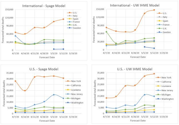
Now we can summarize the forecast of total deaths at various future dates. The intent here was to show that the simpler SEIR Gaussian model and replicate the forecasting of the more complicated SEIR Statistical model and they are very close as you can see, but this was made deliberately. By now having put some SEIR into the Gaussian model we can perhaps anticipate social behavior better. However, we also caution that we are assuming no further social easing, but if social behaviors worsen there could be a much longer death tail and even a resurgence. The UW IHME model, which has consistently under forecasted, a few weeks ago changed their algorithm and now show rampant growth in certain populations (such as CA) that results in much higher forecasted values for all of the U.S. We shall see. As they say “it is difficult to make predictions …. especially about the future.”
SEIR forecasts for U.S. deaths assuming current social easing conditions.
The key take home is that the SEIR Gaussian model can offer comparable forecasting power as the SEIR Statistical model. Though it was shown that both approaches offer comparable forecasting capabilities work, our SEIR Gaussian model uses a single function and only needs the variables σ(1), σ(2), σ(3) and τ(2,3). The parameter τ(1,2) can be fixed at zero and the only other variable used, d, is for calculating and forecasting of case prevalence and incidence. The SEIR Statistical Model requires solving five coupled differential equations and requires the variables r, R0(1), R0(2), R0(3), τ(1,2) and τ(2,3).
(5/21/20) We are going to change emphasis and focus on the U.S. and CA in particular in this update. The Northeast hotspots are recovering well, but other outbreaks are developing across the country and CA may be on the cusp of a huge outbreak.
We are going to dispense with our customary international and U.S. death rate plots to focus on key U.S. states. This is an extension of my recent post (5/19/20 – Daily Rumblings – CA the Next Hotspot), which you should read.
But first let me proudly say that my manuscript describing this model and its attributes has been published on the on-line site MedRxiv and can be found at:
You can preview or download a pdf of the full paper.
I may also start reducing the frequency of updates as these take time and I don’t have a lot of it. Further my model is now being closely replicated by the renowned UW IHME model that I have compared to (see below). My mission to provide state-of-the-art forecasts and to debunk the misleading data that proliferated (and still does) during the early days of this pandemic is less of a concern now.
So, below are death rate plots for the U.S., NY, and CA to show a range of different behavior most likely due to differing levels of diligence in practicing social distancing.
The symmetric Gaussian dotted line is for visualization to accentuate the varying deviations for NY vs. CA. You can see extreme Sunday under-counting for CA and for the U.S. overall but less evident. This quirk in counting deaths is also observed internationally as seen in previous blog posts.
New York was the deadliest place in the world due to Covid-19 and still has a high prevalence (active cases) but it is receding fast. CA is at a much lower level (about 6x lower by per capita), but deaths and hospitalizations are stubbornly flat and not receding (see Daily Rumblings 5/19/20 discussing LA and OC). In fact, CA looks to be going through a death rebound. Very sad; may downgrade it to red again. We forecast the 6x greater prevalence per capita for NY vs. CA (down from 20x three weeks ago) to fall below that in CA in about 3 weeks and this will make NY safer to ease social restrictions sooner than CA (though of course this has already started).
We now show our familiar table for forecasted total deaths, prevalence (current cases), and incidence (new cases) along with their values per capita (per million people) as well as dates we consider to be the earliest to begin a graduate easing of social distancing. We reiterate again that our model does not anticipate future changed behavior such as social relaxing, but rather past behavior, so we expect to see some upward movements that could be quite severe for certain populations. We will be developing a revision to the model to explore various scenarios for relaxation of social restrictions.
Key observations include:
The U.S. trails the rest of the world: There just isn’t much else to say here. There are pockets of improvement particularly in the Northeast, but the rest of the country just doesn’t get it and there is just no leadership to follow. Wearing masks actually does help in many situations, but it also stands as a symbol of solidarity. Most of Americans get that, but the one person who needs to, doesn’t. OK zip it Jack!
NY and NJ: NY as stated above and last week is doing very well so far. NJ, which was showing good progress seems to be hitting a little plateau, which might reflect some regional outbreaks. We hope they can get that under control before the whole state goes to social easing. This is really like wild fires and you have to catch the small brush fires before they explode.
Social easing: I no longer pretend that we should wait as long as the ease dates in the above Table recommend, although that would keep the death rates down. I’ve said it before; we need to socially ease, but we have to be very smart about it and practice good hygiene and behavior. If we do these four things, we should be fine: keep distance where possible, wear a mask when close to people, don’t shake hands or hug, and wash hands and surfaces frequently.
I haven’t presented my favorite log-log plot of death rate vs. cumulative deaths in a while, but it is very informative in showing when recovery begins and also revealing when the recovery is floundering, as you can see below (see Figure caption). The European countries, except Sweden are recovering nicely. The U.S. is showing slow recovery and CA is relapsing badly.
Downward deviations from the linear slope indicate reduction from exponential growth and true recovery would be followed by near vertical recovery lines as seen for China and S. Korea.
Now for our comparison of forecasted total deaths to the venerable benchmark model from the Institute for Health Metrics and Evaluation (IHME) at the University of Washington (UW) (http://www.healthdata.org/covid/).
We’ve talked about these two models before. The IHME model to our knowledge has not yet been published to see what is under the hood. We of course have laid it out in our MedRxiv paper. However, two things are clear: (1) our models are similar as evidenced by the similar forecasts, (2) Whereas we already anticipated asymmetric recovery and built that into our models, they apparently did not and we see evidence of a scrambling to modify their models to account for this. This evidence is that they consistently underestimated total deaths relative to us, but now are almost totally overestimating, which may be right, but feels like tilting the pinball machine. Our forecasts, as measured statistically, still remains more stable regarding volatility (see Plot below) without any apparent penalty in forecasting accuracy (and precision).
(5/14/20) Most of the world and U.S. states are improving in key statistics but agonizingly slow with some exceptions that we highlight. But fortunately, the two biggest hot-spots in the world, NY and NJ, appear to be recovering well. Every other statistic for the U.S., however, lags the rest of the world and underscores the serious consequences of our nation’s delayed and unprepared response to COVID-19.
The plots below show the familiar death rate curves for hotbed countries and U.S. states. We retain Iran for one more week and plan to show Sweden next week as an example of a lackadaisical approach to social containment.
There were no new upgrades in our 3-color ranking system Internationally and Spain is on the verge of a downgrade for its stubbornly persistent death rate. Domestically we gave NY and NJ well-deserved upgrades but WA is on the brink of a downgrade. The NY and NJ death rate decline is faster than most other populations as you can see from the plots below. This can turn at any point, and NJ still shows signs of new outbreaks, so hopefully they do not relax social restrictions too aggressively and start another firestorm. In fact, the whole COVID-19 situation around the world feels like a huge forest fire that we may believe we are just about to contain, but a sudden change in weather could cause another uncontrollable outbreak. With the social, economic, and political pressure to increase social easing, this is bound to happen. Two states that were early leaders in taming the outbreak, WA and CA, are now having a tough time reducing deaths and active cases as evidenced by the plots below. (You can read about the specifics of CA and Orange County in just released Post 16. Can Orange County, CA Begin Opening this Week?)
We continue to plot a symmetric Gaussian but for visualization only. Our analyses now use asymmetric functional fits that we will detail in a separate post in the near future.
Next is our familiar table for forecasted total deaths, prevalence (current cases), and incidence (new cases) along with their values per capita (per million people) as well as dates we consider to be the earliest to begin a graduate easing of social distancing. These results fully incorporate our asymmetric Gaussian model, introduced last week and to be described in a future post and publication. We remind readers that these forecasts do not account for future premature social easing that could set off new outbursts. The forecasts do, however, represent the extent of social distancing to date as they are reflected in the actual death data.
The threshold prevalence for the easing date was raised this week from 100 to 200 active cases per million population for no better reason than I think I was being too stringent. This number really depends on the tolerable death rate, which is a subject we will treat in a future post.
Key observations include:
The U.S. trails the rest of the world: It is hard to criticize our country, but we can’t ignore tough lessons not just for the next pandemic, but for this one if our administration makes yet another mistake and sends premature messages on social easing and digs us into a deeper death trap. By every statistical measure the U.S. lags the rest of the world in handling COVID-19; (i) Next to last to declare an emergency; the U.K. was last, (ii) the last to reach the death rate peak, (iii) last to implement testing and protective gear, and all still at inadequate levels per capita, (iv) has 5% of the world’s population but 30% of the deaths and nearly half of the prevalence (active cases), (v) will be last to be safe to ease social restrictions (but we will not be the last to implement it), (vi) has seen the most upward forecasts of death by major models of any country (see plot below) meaning our social distancing is not being rigorously practiced.
Jack’s rant: I have resisted taking any political views in this forum and have just reported the facts like a good impartial scientist hoping that policy makers will respond appropriately to these facts. However, our nation continues to mismanage this pandemic and is now further sidelining and ostracizing well-meaning medical experts from reporting the truth in order to push a politically motivated agenda to revive the economy. I am all for revitalizing the economy, but at what cost? I will have more to say on this in a future post. But we all have to start speaking out as this callous behavior is needlessly costing tens of thousands of American lives!
NY and NJ: These states have made excellent progress in reducing the death rate; however, because they started at such a high level, they still have the largest per capita death rates in the world being, respectively, 69 and 130 deaths per week per million population vs. the world’s worst of 48, 45, and 34, respectively, for the U.K, Sweden, and the U.S.
Social easing: It is understandable that we must give great consideration to the economy, but we will be worse off if we socially ease prematurely. Easing as little as 2 weeks too soon could lead to epidemic growth again and require another 2 months of social distancing. That is an atrocious tradeoff.
The table below compares our total death forecasts to the benchmark model from the Institute for Health Metrics and Evaluation (IHME) at the University of Washington (UW) (http://www.healthdata.org/covid/).
The IHME model dropped the reporting of ‘days from peak’, but they do report the peak date so we can calculate that above.
The two comparative models give similar results (plots below) suggesting a similar algorithm, e.g., strong dependence on death statistics. By some measures we may be performing better in terms of week-to-week volatility and quickness to detect new trends as can be visually see in the plots below. To compare volatility, we calculated the sum of squares for error (SSE) for variability relative to the latest forecast values. By this SSE measure the IHME model forecasts have varied greater from week to week than the present model for all but one of the cases (France). If averaged for the international and U.S. states, respectively, that we track the SSE’s are: 26% and 26% for our model vs. 41% and 46% for the IHME model (lower means less variability). At present we do not see a penalty to the present model’s relative stability, but time will tell. It also appears that they are about a week behind the trends that we are forecasting as evidenced by their weekly adjustments tending to values we forecasted the previous week. On the other hand, they have made a brazen call on doubling the U.S. forecasted total deaths (not helping their volatility factor), a trend we also see but not to the same magnitude. We hope they are wrong for our country’s sake!