(11/23/20) Covid-19 continues its seasonable acceleration reaching exponential growth much like its first wave in March. The U.S. is showing a bimodal pandemic where states with least restrictions have uncontrollable outbreaks and those with most restrictions are far milder. Sadly, this bimodality correlates with gubernatorial politics.
Snapshot
Here again is a dashboard view of Tables of per capita cumulative deaths and weekly death rates as indicators of total magnitude and current severity, respectively, for the Covid-19 epidemic in various populations locally and internationally. The death rates of Belgium, Italy, France and the U.K have jumped at least four-fold since our last update just a month ago. The U.S. and Spain have more than doubled. Domestically, MI has more than tripled and TX and AZ have about doubled in the last month. Later we show that these are not the worst states by far. Stateside LA death rate is up 50%, but OC and CA have declined over the last month. But ….

Here are the latest death rate plots for the U.S. and CA.

The main observations are:
- The U.S. is surging and showing exponential growth again, frighteningly similar to the original outbreak that started in March.
- Also frightening is that Europe is about a factor of 2 worse than the U.S.
- CA for all the fear and loathing and new restrictions imposed is far better than most states in the U.S. However, this is not time for complacency as cases and hospitalizations are swelling again and we are probably only lagging the seasonal surge due to warmer weather.
- The deadliest states in the U.S. are ND, SD, WY, NE, WI, MN, IA, MN, KS, IN all with greater than 50 weekly deaths per M population, which is more than the states listed above and comparable to Europe (more coverage below).
- Around the world, the currently deadliest region is Europe. Inexplicably Brazil has noticeably dropped in death rate. The rest of Latin American has also turned a corner suggesting that a seasonal effect is real.
The Local Scene
Below are hospitalization and death rate plots for Los Angeles County (LAC) and Orange County (OC).


These are good examples of what are leading vs. lagging indicators. As you know, I have not been a fan of case statistics because in the early days they were vastly understated because of the lack of testing. Testing may still be at inadequate levels but at least they are administered fairly stably so I expect the relative trends to be informative. In the pecking order then, case incidences are leading indicators followed by hospitalizations and then deaths. These trends are clearly seen in the plots for both LAC and OC. Cases are soaring exponentially, which is horrifying if not reversed immediately. This rise is starting to show in the hospitalization rates also increasing exponentially and now we are seeing the first hint of the death rate increasing commensurately. Where this goes is hard to predict. However, Governor Newsom is right to invoke restrictions now rather than wait a couple of weeks when it might be too late to reverse the trend.
At least the trends are now making sense. For nearly two months, as we discussed in previous postings, the statistics for OC were bizarre where hospitalizations were declining but death rates were staying high and even surging. We posed some postulates, but I now think it was due to reporting anomalies whereby death reporting was playing catchup and the surges were not real but just clustering of data. Evidence of a return to normal reporting is that the percentage of hospitalizations that lead to death has come back down to about 2% for all hospitalized patients and about 6-8% for ICU patients and this percentage applies to LAC as well.

I finally mention that I now commend people in OC who months ago were resistant to wearing masks but are now nearly all wearing masks around town and in places of business. Keep it up!
The Nation
The death toll in the U.S. now stands at greater than 250,000. Arguably the most widely accepted Covid-19 forecasting model is that from the Institute for Health Metrics and Evaluation (IHME) at the University of Washington (https://covid19.healthdata.org/united-states-of-america?view=daily-deaths&tab=trend). (Recall in the early days that my forecasting model was shown to be somewhat superior to this one, but over time a team of 10 beats my part-time efforts). IHME forecasts that by March 1 the total U.S. death count will be 471,000 based on current government mandates for social interventions. If only mask mandates were universally implemented that number goes down to 406,000. That is 65,000 future deaths could be avoided by governments and people rising above politics and selfishness and just mandating masks!
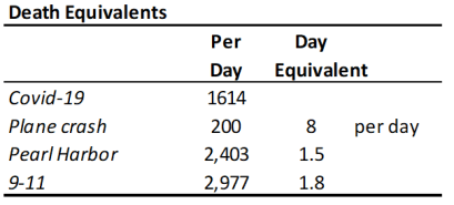
Below is a death equivalent Table that if it does not shock people to reason then probably nothing will. This shows that the current daily Covid-19 death rate is equivalent to 8 plane crashes a day. Can you imagine if there really were 8 plane crashes a day? No one would ever fly on a plane! So why are we so cavalier and careless about Covid-19? Humans can be very irrational. Just to punctuate the atrocity of this pandemic, the daily death rate is equivalent to a Pearl Harbor every day and a half and a 9-11 about every two days.
So, above I showed the benchmark states that I use to get a snapshot of how the states are doing. Well in fact now none of them are in the top 12 hottest states. Those are listed below along with CA for comparison. And in case you are fuzzy on where in the country they are, just look at the map below and figure out which two states are not on the top 12 table (CO and MO are 14 and 17)! In fact, a new infection happens faster than you can say Sturgis Dakota Motorcycle Rally! That’s right that hedonistic, selfish event is responsible for 260,000 Covid-19 infections (as of 9/9/20) and counting (https://khn.org/morning-breakout/sturgis-biker-rally-linked-to-260000-covid-cases/). These 12 states account for 39,000 Covid-19 deaths. If we reasonably attribute half of these to the Sturgis rally then it begs the question: is a Covid-19 death a fair trade for every 20 bikers enjoying a week of drunken debauchery? Here’s another one for you. News articles in the NY Times and LA Times reported on a Stanford study that stated that 18 Trump campaign “events are connected to 30,000 infections and 700 COVID-19 deaths …”

In case you didn’t notice the Dakota’s are experiencing over 140 weekly deaths per million population. This is the highest death rate in the world. By comparison the worldwide average is 9 and CA is at 11 (more than 10x less deadly per capita). Yet South Dakota Gov. Kristi Noem reiterated in a tweet last week, “We already know that lockdowns DON’T stop the spread of the virus.” So, no mask mandates, no nothing, just 150 more caskets every week in a population less than a million.
If this all sounds too outrageous to ignore, then I can no longer maintain my moratorium on political commentary because this carnage is due to the Administrations pressure on states of certain political persuasions to turn a blind eye. The NY Times identified groups of states corresponding to control measures that were tightest, intermediate, and fewest (https://www.nytimes.com/interactive/2020/11/18/us/covid-state-restrictions.html?campaign_id=154&emc=edit_cb_20201120&instance_id=24284&nl=coronavirus-briefing®i_id=119519801&segment_id=44995&te=1&user_id=946571b79386ac1020594361ac6960b3). The Table below stratifies these groups in terms of the governor’s political affiliation. Only 7.6% of Republication governments have implemented tightest controls (vs. 33% Dems) and only 8.3% of Democratic governments have implemented fewest controls (vs. 62% for Reps!).

The NY Times also plotted these states for number of cases and deaths vs. degree of control measures and to no surprise it follows a diagonal line with fewest controls corresponding to greatest Covid-19 outbreaks and tightest controls to least. Since I am on a good rage now, I assert that these politicians (starting at the top) are treating American lives as pawns for their own self interests. This makes their actions or lack of them more hideous than the most vicious mass murderers in history. Why do we Americans allow this to happen!
International
The situation is dire around the world and particularly in Europe. After taking Herculean measures to curb the pandemic when it first hit exponential growth in March and astoundingly knocking it down it is sad to see this recur on a population that is utterly fatigued by Covid-19. I won’t provide the commentary above because I am less familiar with government interventions overseas other than to note that it is taken far more seriously there than here. The Figures below highlight some of these countries.

Some main observations include:
- France, Italy and Belgium in less than a month have accelerated to nearly their previous death rate levels.
- Sweden has renounced its previous lax strategy and is implementing strong social intervention.
- Brazil has actually declined, no thanks to President Bolsonaro. This means either that Brazil is reaching herd immunity or a seasonal effect is making the virus less infectious, probably a combination of both.


