(1/25/21) Vaccination is our only hope as Americans have surrendered to Covid-19. However, we cannot expect more than 10% of the population to get inoculated per month meaning we have several more months to worry about.
Snapshot
The Tables below give a dashboard view of per capita cumulative deaths and weekly death rates as indicators of total magnitude and current severity, respectively, of the epidemic in various populations ranging from local to international. The 4th column shows the direction and magnitude of changes in Covid-19 severity relative to the previous (one month ago) reporting period.
There are no bright spots to speak of. There is some improvement in Europe (Belgium, Italy), but the U.K. is accelerating due to the new more infectious virus strain. The U.S. continues to get worse, but the death rate is starting to flatten, though not for AZ or CA, which remain very deadly by any measure. CA may finally be peaking and rolling over (data below); we can only hope. Just today Governor Newsom lifted the stay-at-home orders restoring the previous color-tiered local-risk system perhaps prematurely like last time.

Here are the latest death rate plots for the U.S. and CA.

Before covering the globe next, it is important to note that society needs to fight this virus, not just to reduce deaths now, but because the faster it spreads, the faster it mutates. We need to slow down these new more virulent strains or risk undermining the effectiveness of these new vaccines.
The Local Scene
I wrote just last week about CA and particularly Los Angeles County (LAC) and Orange County (OC). Below are updated plots.


The bad news is that the third wave of the epidemic is about 5x worse than the previous ones. The encouraging news is it looks like CA has hit its peak and is now declining in case counts. You can also see that hospitalizations are now declining, and we should then expect to see soon a corresponding decrease in the death rate. It is hard to say how far this trend will progress, but epidemic waves for some reason usually recover to a fraction of their peak. But as we have seen twice before, they can reoccur quickly and intensely. Governor Newsom’s stay-at-home order has indisputably helped reverse the third wave, but his announcement today to restore the previous local-risk rating may be premature.
An argument against complacency is that CA now accounts for about 17% of all U.S. deaths despite comprising 12% of the population. That figure was 4% just two months ago, so we have gone through a wicked third wave.

The Nation
Below are death rate plots for some representative U.S. states.

Key observations are:
- AZ is now the nation’s most infectious and deadly state, no surprise given the government’s defiant refusal to implement even the most basic safeguards. So, people are paying with their lives for this foolish political grandstanding.
- TX, another Covid-19 defiant state, is flaring up and will soon join AZ in the ranks of uncontrollable outbreaks.
- MI is one of the few (larger) states in the U.S. that has actually reduced cases and deaths over the last month.
My monthly updates have reported the cumulative U.S. Covid-19 deaths, which have gone from 250,000 (11/20/20) to 330,000 (12/25/20) and now to almost 420,000 deaths (1/22/21). The Covid-19 forecasting model from the Institute for Health Metrics and Evaluation (IHME) at the University of Washington now forecasts 517,000 deaths by March 1.
Next, we update the grim statistics representing number of deaths in terms that we can all relate to. The death equivalents have increased to 19 plane crashes a day. We are now experiencing the mortality of a Pearl Harbor or 9-11 more than once a day. Stop and think about that!

International
The situation is still dire around the world with the worldwide death rate continuing to increase. The initially worst hit European countries, e.g., Italy, Spain, France, U.K., Belgium reached similar levels of carnage in the 3rd wave. But most now appear on the downside of the peak, with the glaring exception of the U.K. who is battling the new more infectious variant of SARS-CoV-2.
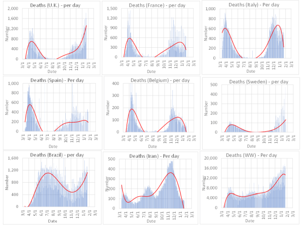
Other observations:
- The death rate for worldwide (WW) has increased from 12,000 to 16,000 per day in just the last month. The U.S. accounts for about 20% of these deaths despite having a population of about 4% that of the entire world.
- Brazil is rising again, which runs counter to a notion of a seasonable effect since South America is now into the summer months.
- Iran has shown a staggering decline, which is hard to explain given its poor control of the pandemic in the past, which raises doubt about the accuracy of their current reporting.