(5/28/20) Interestingly those populations international and domestic who got hit the worst, GET IT! They are recovering fast. Elsewhere, it is a slow drip of agony.
This may be my last update for awhile if I can actually resist. The IHME model is now becoming as good as mine and my voice doesn’t carry very far. But sometimes I get punchy and upset, and when I do, I blog! But I promise no political undertones, well maybe, but definitely no overtones. Although there is still a lot of misleading news that comes out of respectable press it is inadvertent as opposed to misinformation campaigns mounted by some governments (that’s an undertone). So, my mission is now less essential.
International News
I am going to focus on what is critical. So, I am dropping China and S. Korea as solved (at least officially) and dropping Iran because they’ve reached a peak quite a while ago, but can’t get out of their trickle mode plateau, which seems to indicate they are fine with it. We have picked up Belgium and Brazil. Here are some death rate plots:
The symmetric Gaussian dotted line is for visualization to accentuate the varying deviations. The Gaussian fits the rising side, but not falling side well. Notice the Sunday under-reporting effect for most countries.
Belgium has the notoriety as having been the deadliest country in the world with 806 deaths/million (as of 5/27/20), but as I said above now GET IT, but still very deadly as the Tables below show. At its peak Belgium had 183 deaths/ week per million people, by far greater than any other nation (but less than several U.S. states as shown below). Brazil is now in our Hall of Shame for a government that ignored and now is denying the pandemic. Whereas almost all other major countries have peaked in death rate (and prevalence) weeks ago, Brazil continues to climb. But then again how bad is Brazil on a per capita basis? Oddly it is no where near the worst country. Its numbers are big because it has a population of 212 M compared to say Belgium at 11.6 M. So, on a per capita basis Brazil may not be so bad. It’s death rate also appears to be peaking (although that is a big if) and if that is true then we can make the following comparison: It’s forecasted cumulative deaths per million is comparable to the U.S. and its peak death rate is less. One could look at this positively in that given Brazil’s wanton disregard for public health even worse than in the U.S. (that is an undertone, not overtone) it is less deadly and hopefully that is a Southern Hemisphere effect indicating that the virus may indeed be seasonal.
Notice that worldwide there is a strong death rate tail indicating there are new and significant outbreaks around the world of which Brazil is the most noticeable.
The negative value for Spain is due to their readjusting their deaths downward this past week.
Domestic News
Now let’s look at what’s going on in our country. I am going to de-emphasize Washington and Louisiana and focus on the remaining trouble spots, the Northeast and California. Here are some death rate plots:
The symmetric Gaussian dotted line is for visualization to accentuate the varying deviations. The Gaussian fits the rising side, but not falling side well. Notice the Sunday under-reporting effect for most states.
Key observations are as follows:
NY is showing the WE GET IT mentality having seen the worst death rates in the world. But there is still a stubborn persistent tail, but at least it is declining.
NJ is pretty much showing NY fortitude in its recovery, but either a little behind or a little less effective.
CA is simply pathetic; Gov. Gavin Newsom did a good job quickly implementing social distancing mandates and keeping the virus down, but then succumbed to public pressure to ease prematurely and the results are obvious. For that we downgrade CA back to the red zone in our 3-color ranking system. From what I see people in CA don’t care.
So next are Tables that compare to the international ones above. So, although the U.S. might only be the sixth most deadly country based on per capita (hardly an achievement despite Administration claims given 197 countries in the world – undertone), the northeastern states are in fact the deadliest places in the world, led by NY, NJ, CT and MA, all greater than Belgium.
OK, it is now time for the nerd stuff. Below is an update of our regular update Table. Some of this repeats the above but I include it because I am a data junkie and because I spent a lot of time updating it. I reiterate again that this model does not anticipate future changed behavior such as social relaxing, but rather past behavior, so we expect to see some upward movements that could be quite severe for certain populations. We will be developing a revision to the model to explore various scenarios for relaxation of social restrictions.
The easing date threshold was raised from a prevalence of 200/million to 500/million (i.e., 1 in 2000 people are infected) to provide a little more leniency, though perhaps unadvisedly.
Key observations include:
Social easing: This model says no country is safe to ease social restrictions until June earliest, but that isn’t stopping them. So, I don’t push this Easing Date other than to use it as a relative indicator of which countries could ease sooner or later. Not surprisingly, based on the rate of decline in deaths and prevalence (active cases), the U.S. is lagging every major hard-hit country. We are just not recovering as effectively. Disturbingly with the new wave of deaths and prevalence in CA, it is now projected to be the last of the major states that should be easing.
Other tidbits: I am always surprised by some of the outcomes of this model and you have to take forecasting models with a grain of salt, this one included. But this one indicates that the U.S. has more than a third of the world’s active cases (prevalence). The news media says it is about a quarter, but that is because of the missing cases in the U.S. due to still inadequate rates of testing.
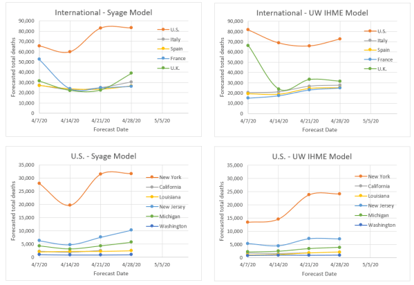
And now for the finale, we reach our model comparison of forecasted total deaths to the benchmark model from the Institute for Health Metrics and Evaluation (IHME) at the University of Washington (UW) (http://www.healthdata.org/covid/).
We’ve talked about these two models before. We are tracking similarly, but the IHME is now forecasting a little higher than us particularly internationally and may be incorporating social easing, which we have not done yet. Our domestic forecasts are very close, but that reflects that most of the deaths have already happened and we are forecasting the fraction that still remains. Our forecasts, as measured statistically, still remain more stable regarding without any apparent penalty in forecasting accuracy (and precision).
(5/21/20) We are going to change emphasis and focus on the U.S. and CA in particular in this update. The Northeast hotspots are recovering well, but other outbreaks are developing across the country and CA may be on the cusp of a huge outbreak.
We are going to dispense with our customary international and U.S. death rate plots to focus on key U.S. states. This is an extension of my recent post (5/19/20 – Daily Rumblings – CA the Next Hotspot), which you should read.
But first let me proudly say that my manuscript describing this model and its attributes has been published on the on-line site MedRxiv and can be found at:
You can preview or download a pdf of the full paper.
I may also start reducing the frequency of updates as these take time and I don’t have a lot of it. Further my model is now being closely replicated by the renowned UW IHME model that I have compared to (see below). My mission to provide state-of-the-art forecasts and to debunk the misleading data that proliferated (and still does) during the early days of this pandemic is less of a concern now.
So, below are death rate plots for the U.S., NY, and CA to show a range of different behavior most likely due to differing levels of diligence in practicing social distancing.
The symmetric Gaussian dotted line is for visualization to accentuate the varying deviations for NY vs. CA. You can see extreme Sunday under-counting for CA and for the U.S. overall but less evident. This quirk in counting deaths is also observed internationally as seen in previous blog posts.
New York was the deadliest place in the world due to Covid-19 and still has a high prevalence (active cases) but it is receding fast. CA is at a much lower level (about 6x lower by per capita), but deaths and hospitalizations are stubbornly flat and not receding (see Daily Rumblings 5/19/20 discussing LA and OC). In fact, CA looks to be going through a death rebound. Very sad; may downgrade it to red again. We forecast the 6x greater prevalence per capita for NY vs. CA (down from 20x three weeks ago) to fall below that in CA in about 3 weeks and this will make NY safer to ease social restrictions sooner than CA (though of course this has already started).
We now show our familiar table for forecasted total deaths, prevalence (current cases), and incidence (new cases) along with their values per capita (per million people) as well as dates we consider to be the earliest to begin a graduate easing of social distancing. We reiterate again that our model does not anticipate future changed behavior such as social relaxing, but rather past behavior, so we expect to see some upward movements that could be quite severe for certain populations. We will be developing a revision to the model to explore various scenarios for relaxation of social restrictions.
Key observations include:
The U.S. trails the rest of the world: There just isn’t much else to say here. There are pockets of improvement particularly in the Northeast, but the rest of the country just doesn’t get it and there is just no leadership to follow. Wearing masks actually does help in many situations, but it also stands as a symbol of solidarity. Most of Americans get that, but the one person who needs to, doesn’t. OK zip it Jack!
NY and NJ: NY as stated above and last week is doing very well so far. NJ, which was showing good progress seems to be hitting a little plateau, which might reflect some regional outbreaks. We hope they can get that under control before the whole state goes to social easing. This is really like wild fires and you have to catch the small brush fires before they explode.
Social easing: I no longer pretend that we should wait as long as the ease dates in the above Table recommend, although that would keep the death rates down. I’ve said it before; we need to socially ease, but we have to be very smart about it and practice good hygiene and behavior. If we do these four things, we should be fine: keep distance where possible, wear a mask when close to people, don’t shake hands or hug, and wash hands and surfaces frequently.
I haven’t presented my favorite log-log plot of death rate vs. cumulative deaths in a while, but it is very informative in showing when recovery begins and also revealing when the recovery is floundering, as you can see below (see Figure caption). The European countries, except Sweden are recovering nicely. The U.S. is showing slow recovery and CA is relapsing badly.
Downward deviations from the linear slope indicate reduction from exponential growth and true recovery would be followed by near vertical recovery lines as seen for China and S. Korea.
Now for our comparison of forecasted total deaths to the venerable benchmark model from the Institute for Health Metrics and Evaluation (IHME) at the University of Washington (UW) (http://www.healthdata.org/covid/).
We’ve talked about these two models before. The IHME model to our knowledge has not yet been published to see what is under the hood. We of course have laid it out in our MedRxiv paper. However, two things are clear: (1) our models are similar as evidenced by the similar forecasts, (2) Whereas we already anticipated asymmetric recovery and built that into our models, they apparently did not and we see evidence of a scrambling to modify their models to account for this. This evidence is that they consistently underestimated total deaths relative to us, but now are almost totally overestimating, which may be right, but feels like tilting the pinball machine. Our forecasts, as measured statistically, still remains more stable regarding volatility (see Plot below) without any apparent penalty in forecasting accuracy (and precision).
This post is a running account for shorter and more frequent updates to try to capture late breaking observations as events continue to change dramatically on a daily basis. I will continue regular posts (numbered) for weekly summaries and particularly poignant news.
5/19/20
The U.S. Continues to Lag the World
There is very little to cheer about in the U.S. even though it does look like the worst may be behind us. But the damage is done. The U.S. has less than 5% of the world’s population but 30% of its deaths and nearly 50% of the world’s active cases. The Northeast was devastated and is/was the deadliest place in the world. The following table shows that each of the four deadliest Northeast states exceed the per capita deaths of any country in the world.
Table of the deadliest U.S. states and foreign countries per capita as of 5/18/20.
There must also be a lot of nervousness in our nation’s capital as DC ranks as the 5th deadliest state (if it was a state).
California – The Next Hot Spot
CA has remained relatively unscathed in terms of infections and deaths (89 deaths per million compared to above table), but that is changing fast and unfortunately you cannot keep people at home when the weather is turning so nice. I witnessed in Newport Beach, crowds the size of Memorial Day crowds at the beach this weekend, with few masks and large congregations and parties and the news is it is happening everywhere. Signs of trouble are already in the statistics. Here are hospitalization rates in Orange County and LA. OC was trending down in early April, but has reversed course lately. LA is at a stubborn plateau.
These numbers are for Covid-19 confirmed and suspected and include all hospitalizations including ICU.
Here are the death rates for OC and LA. Deaths are not coming down very fast and looks like LA may get a rebound. We need to exercise extreme caution if we are to relax social restrictions. Oddly OC is at about 12% of the hospitalizations of LA but only at about 6% of the death rate of LA.
These numbers are daily death rates, but smoothed by a 7-day average to reduce large fluctuations.
As discussed before, deaths occur about 2.5 weeks after infections and hospitalizations somewhere in between. Interestingly the death statistics do seem to follow the hospitalization statistics by about 1-2 weeks. My gut is that we are going to see a rise in these statistics in the coming weeks, particularly in OC.
Sweden – The Experiment that Failed
Despite what is being reported, the experiment by Sweden to forego social restrictions and rely on the people’s good sense has failed. The per capita number of deaths now ranks as the 6th worst in the world and it is climbing faster than the ones above it as they are very much now into recovery. There is still a lot of denial on this, but the numbers don’t lie. The nation’s top epidemiologist, who advocated for this policy, to his credit, has pretty much been saying lately, “oops!”
Social Easing Considerations
Another way of looking at social easing is if the contagion rate was say R0 = 3 on average (this is not a constant, but dependent on environment, population density, culture, etc.), then to relax social restrictions, we would still need to reduce our typical contact rate by 2/3 to get to R0 =1 and no amplification. Maybe that is not too hard if we just practice better hygiene and behavior, e.g., keep distance where possible, wear a mask when close to people, don’t shake hands or hug, and wash hands and surfaces frequently.
…..
5/2/20
U.S. Still Lags the Rest of the World in Recovery
I try to keep personal opinions out of this blog as I strive for fact-based analysis, but I can’t avoid letting a little leak into these Daily Rumblings, having seen deaths to people close to me. Looking at the statistics every day it is depressing to see the U.S. continue to trail the rest of the world including much less advanced countries than ours. Other than the U.K. we were the last in the world to acknowledge the problem and then dawdled on how to respond such that even the U.K. is now ahead of us in recovery. Sweden oddly is in my opinion severely misguided in their voluntary approach to social isolation and they are now experiencing an epidemic that they seem to be denying. There will be plenty of time when this crisis passes to do a post mortem “lessons learned” analysis, but until then we have to continue to socially isolate and obey reasonable restrictions and ignore the babble that’s coming out of our administration and other states.
So here are one of my favorite plots, that I update weekly, for showing the course of recovery internationally and domestically. They mirror the conclusions from the death rate plots that I post in the Weekly Updates, but I think these plots below are visually clearer.
An indication of recovery is when the data turn downward from the positive linear slope. This indicates when the death rate slows down but not when it reaches a peak, which typically occurs a couple of weeks later (the death rate plots are better for seeing that). The points in the plots are weekly averages so each point is spaced by 1 week. The U.S. appears to have finally turned a corner this week, but we really need at least 2 weeks to confirm this trend. Countries like Italy, Spain, France, and the U.K. have turned this corner 3-5 weeks ago.
The situation in the U.S. states mirrors the lag in the overall U.S. statistics. Thankfully the NY death rate has taken a big drop, but again this is only a one-week data point. NJ is struggling as well as CA, though the latter is at about 1/20 the death rate per capita. WA is recovering and although MI and LA now show a two-week trend, the drop is not very big so the verdict is still out on their recoveries.
…..
4/23/20
U.S. Lags the Rest of the World in Recovery
The U.S. is behind all other major hotbed countries regarding signs of recovering from COVID-19. Even the U.K., the last of the countries to implement social distancing, is showing clear signs of getting over the death rate peak. One can look at the death rate plots in yesterday’s post “12. Weekly Update: All Populations are in Recovery” to see the progression from death rate acceleration to deceleration (getting over the peak) to see how much the U.S. is lagging. However, a very sensitive way to also see this is from the log-log plot of death rate vs. cumulative deaths below.
Deviations from the positive linear slope is an indication of progressing past the exponential growth rate. So, the point of departure is actually about half way up the death rate curve, which is about 2 weeks before the peak. The points in the plot above are weekly averages so each point is spaced by 1 week. This shows the U.S. is no less than 2 weeks behind the rest of the world in its progress toward recovery.
This situation in the U.S. states is also not encouraging and mirrors the lag in the overall U.S. statistics compared internationally. The log-log plot for U.S. states below shows encouraging signs for WA, and maybe for LA and MI. But for NY and NJ we may have prematurely called a peak in yesterday’s post. They do not look like they are recovering yet.
…..
4/18/20
A curve ball everyday
Let’s start internationally. Italy and Spain are clearly on the downward slope of the death rate curve and therefore also the prevalence (cases) curve. However, whereas Spain continues down a relatively symmetric path as the way up, Italy seems to have hit a plateau on the way down experience 500-600 deaths/day for the last 5 days (still down from a peak of 1000). If this trend continues up to our weekly update cutoff of Mondays then we will revise up the total forecasted deaths, but probably by no more than 20%. France and the U.K seem to have reached a peak, but we will not know that for sure until we see some downward motion.
Domestically, things are bleaker. NY continues to have a climbing death rate and our call on 4/14 that it had reached a peak appears to be premature. By comparison the UW IHME model claimed it was 4 days past it’s peak so that attests to how difficult it is to make a definitive claim. This will most likely push the total death count in NY to greater than 20,000. The CA death rate has risen to about 90 per day. Though a comparatively low number it is still climbing. Still we think it will be by a large margin a much less affected U.S. state when measured by per capita.
When deaths are not deaths: Not so accurate a measure
Our model premise is based on the assumption that there is no more accurate outcome measure than deaths. Well in the last couple of days we have learned that death counts have been understated for two key reasons: (i) The reported numbers are dependent on how diligent healthcare facilities report deaths and whereas hospitals are pretty reliable and also the primary location for deaths, it is now coming out that nursing homes, assisted living, and other less emergency based facilities have been slow to report this date. (ii) Reported deaths are for confirmed COVID-19 patients and those about to die in hospitals are usually diagnosed, however, it is now acknowledged that many deaths can be attributed to COVID-19 that were not diagnosed. This has caused corrections to data either officially as decreed by the CDC on April 15 or informally as has been done in France and China. In our next weekly update we will describe how we handle these one time surges in reported data.
Can current antiviral drugs work
Everyone is hoping for the magic bullet. Our President has harped on repurposed drugs as the savior and just around the corner. Dr. Fauci has presented a more measured and truthful response. Still there is some hope that a currently approved drug for other viral diseases might at least offer some reduction in death risk for the most afflicted patients. Of the promising candidates that are in expedited clinical trials, Gilead’s Remedivir, developed for Ebola virus, has reported unofficial results from the University of Chicago that suggests for this limited study a marked reduction in deaths in the most severe patients who were given the drug. There is not much more one can say until the statistics are better understood.
Reported confirmed cases way undercounting
In just the last few days we have had the following reports:
China has restated the number of deaths in Wuhan from 2,579 to 3,869 attributed to unaccounted for deaths at home. That this increase is precisely 50.0% raises suspicions about the truthfulness of this report. Based on demands for funeral homes and cremations, some accounts estimate the death count to be closer to 40,000. Regardless of the absolute numbers, I believe they have significantly reduced the death rate so that the curve if not the amplitude is somewhat believable.
At home deaths in NY are also now reported to be significantly undercounted and the official count was adjusted by nearly 4,000 deaths on 4/17/20 to correct for this and this now accounts for about 25% of the total death count in NY.
France made a similar one-day correction on 4/4/20 add about 1,500 to its previous count of 4,500 (now at 19,000, 4/18/20).
Accuracy of COVID-19 diagnostic tests
There have been reports of patients who have had the virus who get re-infected, which has baffled the medical profession. But there may be another explanation, that they never had it in the first place.
The accuracy of a diagnostic test is typically measured by sensitivity, which is the percentage of positive samples the register as positive (true positives and the misses are called false negatives) and specificity, which is the percentage of negative samples that register as positive (false positives vs. true negatives). No test is 100%, but the standard reverse transcription polymerase chain reaction (RT-PCR) is reported to have sensitivity near 100% and specificity of about 96%. This sounds pretty good and it is, however, here is how it plays out in real life. Let’s say you take 100 random people and that 5 have the virus. Then the PCR test will probably detect all 5 positives. However, of the 95 negative patients and a 4% false positive rate there is likely to be 4 negative patients who are diagnosed as positive. Well that is now 9 positive readings of which only 5 are real. So one has to suspect that a significant number of confirmed cases are not true positives.
Now based on current protocols of testing only those most suspected to be infected in which case about 25% register positive, the false positive contribution will be about 16% (4%/25%). However, as we expand testing to more of the general public, this ratio will change dramatically and we need to be prepared for how to handle that situation. I have no suggestions to offer at this time other than to be aware of this error when this data is used for real purposes.
…..
4/11/20
Response time is everything!
U.S. just surpassed Italy today and Spain three days ago in deaths becoming the world’s most afflicted country and with a death rate still growing at an alarming rate.
I try not to get on my soap box, but quick recognition of a problem and immediate implementation of solutions is absolutely crucial to controlling an epidemic. I have shown previously (Post #7: Weekly Update: Grim News), and I’m not by any means alone in this assessment, that every week of dithering will cost a factor of 2-4 in total deaths. That is the perniciousness of exponential growth.
There is now strong evidence (post-crisis analyses should make this irrefutable evidence) that quick action to implement intervention such as social distancing and extensive testing can considerably curb the outbreak and death rate (China, S. Korea, Taiwan, Singapore). Conversely the evidence shows that countries that delay a response suffer costly multiplications of death rate. Examples of late comers are the U.S., France, and U.K, each first nationally sounding the alarm on 3/16, 3/16 and 3/28, respectively, and they are posed to be the three deadliest countries in the world. The U.S. alone, however, didn’t implement any federal actions to recluse, that was left to the states. And again, a good example of the necessity for quick action. CA enacted a stay-at-home edict on 3/18, NY not until 3/23. CA currently has 14 deaths per million people, NY has over 400! So the U.S., the most advanced nation in the world, will be ignominiously remembered for its lack of responsiveness and preparedness costing tens of thousands of American lives. Even worse is that this was willful. This country has 5% of the world’s population and 20% of the COVID-19 deaths.
As far as detecting a rolling over to a peak in infections (new cases or incidence), hospitalization rates are a good indicator, but whereas death rates lag incidence by about 2.5 weeks, hospitalization probably lags by 1-2 weeks since the virus will be coursing through someone before they are serious enough to require hospitalization. So, I still think the gold standard for knowing when you hit a peak is deaths.
The question when is it safe to relax social distancing? That will be addressed in a new blog in a few days. But suffice it to say that life can never return to normal until we have a vaccine or when upwards of 50% of the population has gotten the disease and has developed immunizing antibodies. Otherwise we will be just back to where we started.
…..
4/4/20
Italy and Spain reaching peak deaths. U.S. still accelerating.
Below are latest death rate plots for our coverage of hot-spot countries. There appears to be a real rolling over in the rate for Italy, that we perceived a couple of days ago, which allowed us to rank it yellow (red, yellow, green ratings) and now looks to be reaching a peak. If so our death projections in Post #8 may come down by a factor of 2. Spain also may be further up the death rate curve than thought two days ago. Unfortunately the U.S. France, and U.K are still in exponential growth so still low on the death rate curve.
Death rate plots with our ranking of seriousness. There is an apparent rollover for Italy and Spain over the last few days
The U.S. is lagging most of the rest of the world perhaps due to being late to declare COVID-19 a national emergency. New York and California are still in exponential growth, though per capita NY is still about 20x higher in total deaths and death rate. Washington state is appearing to be reaching a peak.
That’s it for today. Serious social isolation needs to be practiced.
…..
3/28/20
U.S. News
We are tracking NY, CA, and WA, but may add to that soon. Below are plots of the daily death counts for these states and the following are observations:
Daily death rates for U.S. states. The fitted curve is a binomial trend line extended out 3 weeks.
It appeared for a few days that WA was containing the contagion but on 3/27 there was a surge.
NY and CA also look to be leveling off, but we will need at least a couple of more days to see if the death rate is slowing; however, they are not going down yet either.
Another way to look at the data is per capita. The table below reveals how horrendous NY is at this time especially compared to CA that is also considered a hot spot, but not nearly so when viewed per population.
Per capital NY has 15x more deaths and 25x greater daily death rate than CA. Washington has a very high cumulative deaths per capita but its deaths per day is subsiding.
Not shown in the plots or tables, we estimate the number of true cases today are about 1 in 240 people in NY, 1 in 4000 in CA and 1 in 1300 in WA. The numbers will be less if social distancing has been working since inception about 1-2 weeks ago.
On the whole the U.S. cumulative deaths now exceed 1,500 though flattening out at about 200-250 deaths per day! We’ll be anticipating a reduction in the next few days due to social distancing (fingers crossed!).
Regarding other states:
Louisiana has catapulted to #3 in the nation for total deaths (119 yesterday and 137 today and counting) and 1st in death rate (as of yesterday), but NJ has now just overtaken them today to #3 (140 deaths and counting) and is now comparable to the top death rates (about 25% increase per day). Louisiana’s sudden emergence may be due to a surge in cases arising from Mardi Gras that is now evolving to either recovery or death.
Other new trouble spots are MI (111 deaths), FL (54 deaths) and IL (47 deaths).
International News
Below are plots of daily death counts for several countries that we are tracking and the following are observations:
Daily death rates for countries around the world. The fitted curve is a binomial trend line extended out 2 weeks.
Spain has nearly overtaken Italy for number of deaths/day although both countries are still experiencing alarming death rates.
The press sometimes reports news based on two-day trends. This leads to false conclusions, which is dangerous misinformation and what I try to avoid here. The reasons why short term trends can be false include:
Official numbers are often miscounted when counting live and it sometimes takes a couple of days for the numbers to settle down. I see this in the gold standard daily reports published by the WHO. For some reason they lag quite a bit on U.S. deaths.
Often there are two sets of daily numbers, those collected on Greenwich Mean Time (GMT) and others collected in local time zones. For example, a GMT reaches midnight when say California is at 4 pm. That means by the GMT standard, the subsequent CA count will be included in the next GMT day. I will update with whatever data is most current, but I then reconcile to the WHO GMT data when it comes out the next day.
The U.S. appears to be trending toward a flattening out of the death rate. Let’s follow this for a couple of more days to see if it persists.
Italy looked to be flattening too but then saw a surge on 3/27. Too soon to tell what the trend is.
Iran seems to have flattened their death rate. Let’s now hope to see a reduction in daily rates that trends toward near zero
The U.K. also gave a false hope for a few days, but then surged upward on 3/26 and 3/27.
I like the following representation of cumulative deaths plotted on a log scale. I have presented similar plots, but this puts it on a scale starting at 10 deaths for each country so the days since do not occur on the same calendar days, but is a good way to see whether a country’s death rate presages a previous country’s agony. For example, although Spain lags Italy in deaths because its contagion started about 11 days later, the death rate appears to be greater than it was in Italy for the same time after inception. Spain is in Italy-scale serious trouble.
We still do not see too many bright spots around the world, but most countries are still within 2 weeks of initiating strict measures, so if these are effective we may not see them in the death statistics for another week or so.
Death rates for countries on a log scale showing doubling rates (From Johns Hopkins University).
(5/14/20) Most of the world and U.S. states are improving in key statistics but agonizingly slow with some exceptions that we highlight. But fortunately, the two biggest hot-spots in the world, NY and NJ, appear to be recovering well. Every other statistic for the U.S., however, lags the rest of the world and underscores the serious consequences of our nation’s delayed and unprepared response to COVID-19.
The plots below show the familiar death rate curves for hotbed countries and U.S. states. We retain Iran for one more week and plan to show Sweden next week as an example of a lackadaisical approach to social containment.
There were no new upgrades in our 3-color ranking system Internationally and Spain is on the verge of a downgrade for its stubbornly persistent death rate. Domestically we gave NY and NJ well-deserved upgrades but WA is on the brink of a downgrade. The NY and NJ death rate decline is faster than most other populations as you can see from the plots below. This can turn at any point, and NJ still shows signs of new outbreaks, so hopefully they do not relax social restrictions too aggressively and start another firestorm. In fact, the whole COVID-19 situation around the world feels like a huge forest fire that we may believe we are just about to contain, but a sudden change in weather could cause another uncontrollable outbreak. With the social, economic, and political pressure to increase social easing, this is bound to happen. Two states that were early leaders in taming the outbreak, WA and CA, are now having a tough time reducing deaths and active cases as evidenced by the plots below. (You can read about the specifics of CA and Orange County in just released Post 16. Can Orange County, CA Begin Opening this Week?)
We continue to plot a symmetric Gaussian but for visualization only. Our analyses now use asymmetric functional fits that we will detail in a separate post in the near future.
Next is our familiar table for forecasted total deaths, prevalence (current cases), and incidence (new cases) along with their values per capita (per million people) as well as dates we consider to be the earliest to begin a graduate easing of social distancing. These results fully incorporate our asymmetric Gaussian model, introduced last week and to be described in a future post and publication. We remind readers that these forecasts do not account for future premature social easing that could set off new outbursts. The forecasts do, however, represent the extent of social distancing to date as they are reflected in the actual death data.
The threshold prevalence for the easing date was raised this week from 100 to 200 active cases per million population for no better reason than I think I was being too stringent. This number really depends on the tolerable death rate, which is a subject we will treat in a future post.
Key observations include:
The U.S. trails the rest of the world: It is hard to criticize our country, but we can’t ignore tough lessons not just for the next pandemic, but for this one if our administration makes yet another mistake and sends premature messages on social easing and digs us into a deeper death trap. By every statistical measure the U.S. lags the rest of the world in handling COVID-19; (i) Next to last to declare an emergency; the U.K. was last, (ii) the last to reach the death rate peak, (iii) last to implement testing and protective gear, and all still at inadequate levels per capita, (iv) has 5% of the world’s population but 30% of the deaths and nearly half of the prevalence (active cases), (v) will be last to be safe to ease social restrictions (but we will not be the last to implement it), (vi) has seen the most upward forecasts of death by major models of any country (see plot below) meaning our social distancing is not being rigorously practiced.
Jack’s rant: I have resisted taking any political views in this forum and have just reported the facts like a good impartial scientist hoping that policy makers will respond appropriately to these facts. However, our nation continues to mismanage this pandemic and is now further sidelining and ostracizing well-meaning medical experts from reporting the truth in order to push a politically motivated agenda to revive the economy. I am all for revitalizing the economy, but at what cost? I will have more to say on this in a future post. But we all have to start speaking out as this callous behavior is needlessly costing tens of thousands of American lives!
NY and NJ: These states have made excellent progress in reducing the death rate; however, because they started at such a high level, they still have the largest per capita death rates in the world being, respectively, 69 and 130 deaths per week per million population vs. the world’s worst of 48, 45, and 34, respectively, for the U.K, Sweden, and the U.S.
Social easing: It is understandable that we must give great consideration to the economy, but we will be worse off if we socially ease prematurely. Easing as little as 2 weeks too soon could lead to epidemic growth again and require another 2 months of social distancing. That is an atrocious tradeoff.
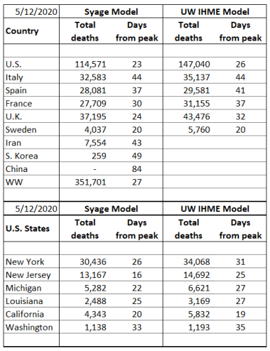
The table below compares our total death forecasts to the benchmark model from the Institute for Health Metrics and Evaluation (IHME) at the University of Washington (UW) (http://www.healthdata.org/covid/).
The IHME model dropped the reporting of ‘days from peak’, but they do report the peak date so we can calculate that above.
The two comparative models give similar results (plots below) suggesting a similar algorithm, e.g., strong dependence on death statistics. By some measures we may be performing better in terms of week-to-week volatility and quickness to detect new trends as can be visually see in the plots below. To compare volatility, we calculated the sum of squares for error (SSE) for variability relative to the latest forecast values. By this SSE measure the IHME model forecasts have varied greater from week to week than the present model for all but one of the cases (France). If averaged for the international and U.S. states, respectively, that we track the SSE’s are: 26% and 26% for our model vs. 41% and 46% for the IHME model (lower means less variability). At present we do not see a penalty to the present model’s relative stability, but time will tell. It also appears that they are about a week behind the trends that we are forecasting as evidenced by their weekly adjustments tending to values we forecasted the previous week. On the other hand, they have made a brazen call on doubling the U.S. forecasted total deaths (not helping their volatility factor), a trend we also see but not to the same magnitude. We hope they are wrong for our country’s sake!
(5/13/20) I am grateful to have been invited to write a feature on COVID-19 in California and Orange County (OC) in the Orange County Business Journal for the prestigious back page OC Leader Board. There is a lot going on in OC and like everywhere strong sentiment to begin easing social restrictions. Gov. Gavin Newsom is implementing plans to relax restriction, but contingent on meeting certain metrics regarding rates of decreases of active cases and minimum testing requirements. Nearly all counties do not meet them yet, but of course we are seeing open rebellion, Tesla being the most covered example.
California has been doing very well compared to other states in the union and OC better than most CA counties. However, the numbers, e.g., death rate, cases, and most particularly hospitalization rates are not declining as expected and this vulnerable population is still prone to a major outbreak, particularly as LA is reaching epidemic proportions. Rather than repeat what I have written, please check out the article. Here is the article and a link to download:
(5/6/20) Recovery is everywhere but stubbornly slow and gives pause to suggested safe easing dates. CA and NJ are significantly revised out in time due to persistently high daily deaths and hospitalization counts. We also highlight an interesting “Sunday Effect”. This week we implemented our asymmetric Gaussian model to account for the slow downslope and compare further to the UW IHME model.
You know the drill so we will launch into it.
The plots below show the familiar death rate curves for hotbed countries and U.S. states. We dropped China and Korea last week as now being “uninteresting.” Next week we will drop Iran and add Sweden to highlight a country that is paying the price for a lackadaisical approach to social containment.
Internationally there are new upgrades (U.S. marginally, France), but also two down-grades (Italy, Iran) on our 3-color ranking. Domestically MI got an upgrade.
We continue to plot a symmetric Gaussian but for visualization only. Our analyses now use asymmetric functional fits that we will detail in a separate post in the near future.
We make the following observations:
All of our tracked hotbed countries and U.S. states are on the downside of the death peak and therefore the prevalence (case) peak. However, it just doesn’t feel solid with several sudden surges most likely due to reporting fluctuations, but we worry about hidden deaths and small outbreaks that can grow quickly into big ones.
Do Fewer People Die on Sunday? We have noticed fluctuations in the death rates, but now we see that it is repeatable and is found in many countries and states. We have adjusted our plot grid lines to lie on Sundays and you can readily see the strong dip in reported deaths. These are particularly noticeable in the U.S. (NJ, LA, CA), but also in Europe (U.K. and very much Sweden not shown this week). We attribute this to a data recording quirk.
The symmetric Gaussian model is breaking down on the downside of the death rate curve as we expected and we have implemented an asymmetric function that has different sigma values for the rise and fall sides of the rate curve. We will discuss the details in an imminent post.
Next is our familiar table for forecasted total deaths, prevalence (current cases), and incidence (new cases) along with their values per capita (per million people) as well as dates we consider to be the earliest to begin a graduate easing of social distancing. We will continue to call this an easing date and not a safe date to dampen excessive hopefulness.
We have lowered the mortality factors for Italy and Spain from 2% to 1.5% and for NY and WA from 1.5% to 1.0% as the healthcare system in these populations are becoming less overwhelmed in treating patients.
Last week we implemented an asymmetry factor to adjust our values until we could come up with a rigorous functional form. This has now been implemented but still needs to be “burned in” and tested more but we felt it was important to apply it here. Most of our forecasts have gone up only moderately, but some rather significantly (US, NJ, CA). This has also pushed out the so-called easing date for most populations and significantly, a month or greater, for the latter ones cited. As these dates are untenable in the current social, economic, and political climate very careful limitations need to be placed on any phased easing of social restrictions that should occur before these dates. We will also give further consideration to whether our threshold of 100 active cases per million people for safe easing is too stringent and whether we could recommend more modest easing at earlier dates.
But we mustn’t lose sight that we are at great risk of prematurely easing, which as Dr. Fauci has said “could backfire.” We will need to observe outcomes in Europe and U.S. states where social easing is already being implemented. I’d be interested in your thoughts on my posting: “11. Recommended Guidelines for Easing of Social Distancing,” which proposes a three-phased easing with check-gates at each step.
We now wrap up by comparing our results to that of the Institute for Health Metrics and Evaluation (IHME) at the University of Washington (UW), which is now the most highly cited and quoted model for informing our nation on the state of COVID-19 (http://www.healthdata.org/covid/).
The IHME model seems to have dropped the statistic for ‘days from peak’ that we found to be an interesting comparison.
It is clear that we have similar components to our models with an apparent heavy emphasis on death rate. This is a very nice, visual, and professionally developed model (funded by Bill Gates) that we can’t compete with in its full glory. The IHME model has also moderately to significantly increased their total death forecasts, particularly for the U.S. to the point where it feels like they are putting a little “tilt” into it in response to latest administration and media hype. We shall see. The two models differ on Sweden in which IHME is projecting more than twice as many deaths as us. They may be factoring in a social distancing component to their model that amplifies this number. We believe that the death rate curve embodies all of these effects.
Although the two comparative models give generally similar results, by some measures we may be performing better in terms of week-to-week volatility and quickness to detect new trends (see post 14. Benchmarking COVID-19 Forecasting Models). Our model also provides calculations of current and forecasts of future prevalence (active cases) and incidences (new cases) that are notoriously difficult to measure because of lack of adequate COVID-19 testing making the reported confirmed values almost meaningless.
(5/2/20) There are probably as many different opinions on models as there are models themselves. None can forecast with total accuracy and if one could you wouldn’t know it until it is too late. Still we need some forecasting tools to guide policy and responses.
As evident throughout this blog, we have been developing a model based primarily on the most reliable data available, deaths. From death rate and cumulative deaths and other measurable variables, we can compute number of cases (prevalence) and new cases (incidence) as well as forecast these values as well as deaths into the future. A useful outcome of these tools is the ability to forecast dates when it is safe to resume some level of work and social activity.
However, how do we know if a model is performing well? That usually means running it on historical data. Even though, like trying to predict the stock market, past performance is no guarantee of future results. We are here in the middle of an epidemic and so we can gain some indication based on the most recent historical performance. We can also compare ourselves to other models. However, all models are different and give different results. Still we have been benchmarking to what is emerging as the gold standard model and is now clearly the most widely followed model by the press and government agencies. This is the model by the University of Washington’s (UW) Institute for Health Metrics and Evaluation (IHME). The details of this model have not yet been published and are not well known. We believe we have many similarities such as depending strongly on death statistics.
The IHME and our model also make updates to forecasts based on new data. This would seem to be a sensible approach, but many “expert” modelers and epidemiologists consider this strategy a shortcoming because the forecasts can bounce around. Well I began my model for the very reason that these so-called experts were pontificating things that seemed far fetched and their models seemed to be too complicated with many variables that are hard to measure or define. So, these models may be good for ultimately understanding pandemics better (after the fact), but we are in the middle of a pandemic and need some real-time guidance and forecasts so I believe the strategy that I, and apparently IHME, are taking are valuable. There is a need for many models as they all make different assumptions or are trying to measure or forecast different properties.
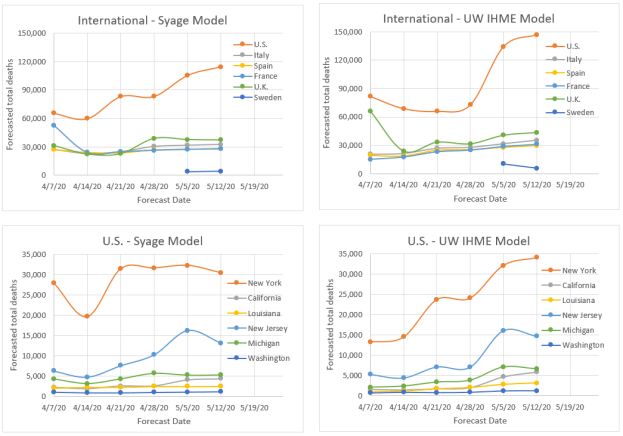
So, to cut to the chase the plots below show the forecasted total final deaths for the various hotbed countries and U.S. states that my model is following alongside the IHME model forecasts over the same time period.
The following are key observations:
The two models would appear to be more similar than dissimilar based on the relative qualitative agreement on death forecasts, e.g., the order of severity for different countries and states.
Both models fluctuate, but not excessively relative to an epidemiological model that is calculating based on first principles.
Both models seem to be on a slight rise in forecasting deaths. We think that is because both models a priori assume that the rise and fall behavior are symmetric, but evidence is now showing the decline is slower. We know how to modify our model to do this, but will not be able to do so before the pandemic mostly plays out. Instead we are applying an asymmetry factor to the downside to compensate. We do not know if IHME is doing anything similar.
Our latest forecasts are all above those of IHME, but not greatly making us think that the difference is due to our including the asymmetry factor for the first time in the last update.
Not shown in these plots but evident in the Weekly Update postings is that we tend to read the death rate data such that we believe countries and states are not as far past the peak as IHME indicates. We think this is due to our using a Gaussian function to monitor peaking, whereas they use an error function (integral of a Gaussian) to do so, which we believe is less sensitive to detecting changes, e.g., peaking. We both apparently use the error function to forecast total deaths but from different parts of the curve depending on how we read displacement from the peak.