(5/14/20) Most of the world and U.S. states are improving in key statistics but agonizingly slow with some exceptions that we highlight. But fortunately, the two biggest hot-spots in the world, NY and NJ, appear to be recovering well. Every other statistic for the U.S., however, lags the rest of the world and underscores the serious consequences of our nation’s delayed and unprepared response to COVID-19.
The plots below show the familiar death rate curves for hotbed countries and U.S. states. We retain Iran for one more week and plan to show Sweden next week as an example of a lackadaisical approach to social containment.
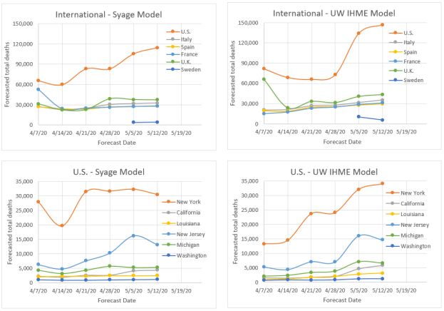
There were no new upgrades in our 3-color ranking system Internationally and Spain is on the verge of a downgrade for its stubbornly persistent death rate. Domestically we gave NY and NJ well-deserved upgrades but WA is on the brink of a downgrade. The NY and NJ death rate decline is faster than most other populations as you can see from the plots below. This can turn at any point, and NJ still shows signs of new outbreaks, so hopefully they do not relax social restrictions too aggressively and start another firestorm. In fact, the whole COVID-19 situation around the world feels like a huge forest fire that we may believe we are just about to contain, but a sudden change in weather could cause another uncontrollable outbreak. With the social, economic, and political pressure to increase social easing, this is bound to happen. Two states that were early leaders in taming the outbreak, WA and CA, are now having a tough time reducing deaths and active cases as evidenced by the plots below. (You can read about the specifics of CA and Orange County in just released Post 16. Can Orange County, CA Begin Opening this Week?)


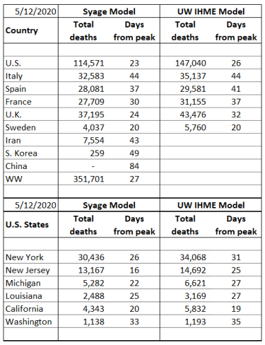
Next is our familiar table for forecasted total deaths, prevalence (current cases), and incidence (new cases) along with their values per capita (per million people) as well as dates we consider to be the earliest to begin a graduate easing of social distancing. These results fully incorporate our asymmetric Gaussian model, introduced last week and to be described in a future post and publication. We remind readers that these forecasts do not account for future premature social easing that could set off new outbursts. The forecasts do, however, represent the extent of social distancing to date as they are reflected in the actual death data.


Key observations include:
- The U.S. trails the rest of the world: It is hard to criticize our country, but we can’t ignore tough lessons not just for the next pandemic, but for this one if our administration makes yet another mistake and sends premature messages on social easing and digs us into a deeper death trap. By every statistical measure the U.S. lags the rest of the world in handling COVID-19; (i) Next to last to declare an emergency; the U.K. was last, (ii) the last to reach the death rate peak, (iii) last to implement testing and protective gear, and all still at inadequate levels per capita, (iv) has 5% of the world’s population but 30% of the deaths and nearly half of the prevalence (active cases), (v) will be last to be safe to ease social restrictions (but we will not be the last to implement it), (vi) has seen the most upward forecasts of death by major models of any country (see plot below) meaning our social distancing is not being rigorously practiced.
- Jack’s rant: I have resisted taking any political views in this forum and have just reported the facts like a good impartial scientist hoping that policy makers will respond appropriately to these facts. However, our nation continues to mismanage this pandemic and is now further sidelining and ostracizing well-meaning medical experts from reporting the truth in order to push a politically motivated agenda to revive the economy. I am all for revitalizing the economy, but at what cost? I will have more to say on this in a future post. But we all have to start speaking out as this callous behavior is needlessly costing tens of thousands of American lives!
- NY and NJ: These states have made excellent progress in reducing the death rate; however, because they started at such a high level, they still have the largest per capita death rates in the world being, respectively, 69 and 130 deaths per week per million population vs. the world’s worst of 48, 45, and 34, respectively, for the U.K, Sweden, and the U.S.
- Social easing: It is understandable that we must give great consideration to the economy, but we will be worse off if we socially ease prematurely. Easing as little as 2 weeks too soon could lead to epidemic growth again and require another 2 months of social distancing. That is an atrocious tradeoff.
The table below compares our total death forecasts to the benchmark model from the Institute for Health Metrics and Evaluation (IHME) at the University of Washington (UW) (http://www.healthdata.org/covid/).

The two comparative models give similar results (plots below) suggesting a similar algorithm, e.g., strong dependence on death statistics. By some measures we may be performing better in terms of week-to-week volatility and quickness to detect new trends as can be visually see in the plots below. To compare volatility, we calculated the sum of squares for error (SSE) for variability relative to the latest forecast values. By this SSE measure the IHME model forecasts have varied greater from week to week than the present model for all but one of the cases (France). If averaged for the international and U.S. states, respectively, that we track the SSE’s are: 26% and 26% for our model vs. 41% and 46% for the IHME model (lower means less variability). At present we do not see a penalty to the present model’s relative stability, but time will tell. It also appears that they are about a week behind the trends that we are forecasting as evidenced by their weekly adjustments tending to values we forecasted the previous week. On the other hand, they have made a brazen call on doubling the U.S. forecasted total deaths (not helping their volatility factor), a trend we also see but not to the same magnitude. We hope they are wrong for our country’s sake!