(4/14/21) There is no doubt that vaccines work and the stepped-up effort by our Administration to achieve widespread vaccination is saving tens of thousands of lives. Unfortunately, most of the world is seriously lagging and it correlates directly to the effectiveness of their vaccination programs.
Snapshot
At each of these monthly (or longer) interludes I hope (pray) that there will be no further need for these updates given the reality of this recovery. But things are never that simple and coronavirus is very much alive in most of the world. But the trends are good.
The Tables below give a dashboard view of per capita cumulative deaths and weekly death rates as indicators of total magnitude and current severity, respectively, of the epidemic in various populations ranging from local to international. The 4th column shows the direction and magnitude of changes in Covid-19 severity relative to the previous reporting period (6 weeks ago).
Cumulative death and death rate data for select populations around the world (as of 4/9/21).
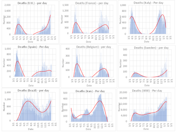
In this short period of time CA and particularly Orange County and Los Angeles County have enormously reduced cases, hospitalizations, and deaths. OC and LAC have reduced the death rate to near zero. The U.S. has also made great strides with some exemptions, such as MI. The rest of the world, however, is stumbling along. Whereas the UK, ground zero for a new variant, has astonishingly beat (for now) their recent severe wave, other European nations, e.g., Italy, France, and Belgium are suffering through yet a new 4th wave. Brazil remains a basket case and continues as a world leader in government indifference. So, what accounts for these disparate trends? Vaccines! The UK aggressively deployed vaccinations and they did what I recommended months ago by maximizing the number of people getting first shots and delaying the second booster shot. This strategy worked incredibly well as you will see shortly in the more detailed discussion below. [An article in the NY Times yesterday, 4/13/21, recites experts who are now advocating for the single dose approach to maximize the inoculated population.] Israel is another great example of the success of aggressive vaccination.
The U.S. vaccine distribution program has progressed from total ineptness to becoming a world leader in just a couple of months. The EU was too bureaucratic to implement emergency measures and consequently late to procure vaccines and put a distribution plan in place. Perhaps Brexit was a blessing in allowing the UK to implement a rapid response plan without the bureaucratic drag of the EU.
Here are the latest death rate plots for the U.S. and CA as well as the US daily case rates.
Daily death and case rate data for the U.S. and CA. The case rate for the U.S. (middle plot) just covers the time-period for the third wave. Red line is 7-day moving average.
The U.S. and CA are on a clear downward trend with death rate down to 1/3 and 1/5 from their peaks for the U.S. and CA, respectively. U.S. case rates are also significantly down but notice there is now a clear rebound. I do not view this as very serious and in fact predicted this in my last update 6 weeks ago. This is because there are two opposing forces operating. Our country is tired of the pandemic and there is clear social relaxation everywhere in addition to the spread of new more contagious and maybe more potent virus variants. This upward pressure on cases is mitigated by an effective vaccination program to reduce the susceptible population. So, if you multiply a positive going function by a negative going function you get a function that looks like a hump. The size of that hump depends on how quickly we reduce the susceptible population by vaccination. So, I think the U.S. hump will be small. But you will see shortly that the hump will be, if not already, very big in countries where vaccine deployment is slow.
The Local Scene
In southern CA you couldn’t hope for better progress than what you see in the figures below. The rate of new cases and deaths for LAC and OC is just a few percent of its peak values just 2-3 months ago. This is not due just to social restrictions, though Gov. Newsom should get some credit here! It is also due to a high percentage of these populations becoming immune from having caught Covid-19 (perhaps 20% in OC and 33% in LAC) and even more so to effective vaccination deployment. To put this into perspective your chances of getting infected if you are not yet immune are only a few percent of what they were just a few months ago when I alerted that more than 1 in 100 people in both counties were infected and contagious at any given time. When I first heard Newsom say that June 15 will mark a full reopening, I thought this might be premature. But given the current positive trends and assuming it is more likely to get better than worse, then I agree, given there must be an easing date eventually, that this is not too reckless a date.
Cases, hospitalizations, and death rate for Los Angeles County (as of 4/9/21). Red line is 7-day moving average.Cases, hospitalizations, and death rate for Orange County (as of 4/9/21). Red line is 7-day moving average.
A small mystery in the above plots is why hospitalizations due to Covid-19, though significantly lower than their peak, are not as close to the baseline as the case and death rates would suggest. The plot below shows hospitalization death rates for all and for intensive care unit (ICU) patients. These rates, which hovered around 2% and 6% for most of the pandemic are now decreasing. By the way, if anyone says that hospitals were not overtaxed by the most recent severe outbreak in CA just look at the hospitalization death probabilities that peaked to 20% and 15% for ICU in LAC and OC, respectively. This is because the level of care was extremely strained and that patients, other than the most severe, were turned away for lack of beds and resources. This was an especially dreadful time for hospital workers, the patients, and their families.
Hospitalization death rates. Solid lines are 2 week moving averages.
The Nation
Below are death rate plots for the same representative U.S. states we have shown before in case anyone is comparing.
Death rate plots for select U.S. states (as of 4/9/21). Red line is 7-day moving average.
Key observations are:
The situation around the U.S. is looking promising notwithstanding the case rebound seen in some states.
Some of the hardest hit states, e.g., FL, AZ, TX, that were lax on social distancing measures have recovered significantly from their peaks perhaps due to high immunity from pervasive infections in their states.
MI is reporting a severe new outbreak based on new case data. Oddly the death rate, though trending up, is still well below its wintertime peak. Deaths are a lagging indicator so we expect the daily rate to climb for another few weeks before recovering as vaccinations increase.
My last four monthly updates have reported the U.S. Covid-19 death 250,000 (11/20/20) to 330,000 (12/25/20) to 420,000 (1/22/21) to 510,000 deaths (2/26/21). Now 6 weeks later we stand at 560,000 with a chance we never see 600,000. However, that does not mean we should become complacent. The death rate even at 1/3 of its peak is still at about 1,000 deaths per day, which looks very grim when compared to historically huge tragedies in our nation’s past.
International
The world is mostly in recovery but with some disturbing hot spots. Death rate plots are presented below for selected countries that we have been following before.
Death rate plots for select countries and for worldwide (as of 4/9/21). Red line is 7-day moving average.
Key observations:
The EU has struggled to implement an effective vaccination program, which is evident in the slow recovery from the 3rd pandemic wave that peaked in Dec-Feb. and is now leading to a 4th wave spurred mostly by new virus variants and fatigue in continuing with lock downs. In terms of death rate Italy is suffering the worst of the rebounds followed by France, Belgium, and Spain (above plots and further above tables). However, looking at new case rates in the figure below one sees that per capita the order starting with the worst is France, Italy and Spain.
The UK being ground zero had one of the worst recent outbreaks in the world. However, unlike some its previous tepid responses, this time they put in herculean effort to combat the outbreak. Perhaps one of the most judicious decisions was to deviate from the prescribed vaccination protocol of giving individuals two shots and instead decided to spread single shots to the maximum number of people. As you can see from the plot above the UK smothered an out-of-control outbreak in just two months. Perhaps Brexit deserves some credit by freeing the UK from the series of missteps by the EU commission in vaccination planning that now plagues the rest of Europe.
One has to sympathize with Brazilians for being victims of a government that sneers at Covid-19 and makes little attempt to protect their citizens. They are by far suffering the greatest death rate of any country in the world and now exceed the records set by the U.S. This neglect is compounded by having entered the Fall season, typically an accelerator of flu transmission. They are destined to reach herd immunity by having the great majority of their population catch Covid-19.
We have focused on our perennial countries as I don’t have the time to delve into other countries. However, it is worth noting that India is now accounting for much of the uptick in worldwide cases. Also, the total reported deaths in Russian are very short of the number obtained by looking at the increase in total deaths relative to the same time period in prior years.
New cases per week per 100,000 inhabitants in Europe (as of 4/13/21). Data from Statista and Johns Hopkins University.
(2/28/21) Over 500,000 Americans have died due to Covid-19, but there is a real chance we do not ever hit 600,000. Still new variants are lurking and accelerating so watch out for another small rebound.
Snapshot
I’ll continue with the usual format, but I have added to the end a Q&A on important issues that I haven’t seen properly or correctly addressed by our officials or the media so have a look at that too.
The Tables below give a dashboard view of per capita cumulative deaths and weekly death rates as indicators of total magnitude and current severity, respectively, of the epidemic in various populations ranging from local to international. The 4th column shows the direction and magnitude of changes in Covid-19 severity relative to the previous reporting period (5 weeks ago).
What a difference in just 5 weeks. In the last posting the world was on fire with essentially every part of the world rising on the third wave with alarming speed. Today we are definitely over the peak and riding down the tail at a reassuring rate. The U.S. is lagging a bit on the rate of decline, but the movement is in the right direction and appears sustainable. In harder hit places of the world and in the U.S. best estimates now indicate that 15-30% of these populations were infected and are now immune and removed from the susceptible population. With vaccination rates continuing to increase (about 15% of Americans by 2/26/21) we will approach (but may never reach – more later) herd immunity by late summer in the more aggressive countries and that includes the U.S. We must still continue masking and social distancing so that new strains don’t accelerate during the time we are knocking down the epidemic and undo the good work.
Cumulative death and death rate data for select populations around the world (as of 2/26/21).
Here are the latest death rate plots for the U.S. and CA. I have also added the US daily case rates.
Daily death and case rate data for the U.S. and CA. The case rate for the U.S. (middle plot) just covers the time period for the third wave.
We briefly note here that the U.S. and CA are on a clear downward trend. We show for the first time the daily U.S. case rate as there appears to be a plateauing to a still very high level over the last week or two, which is worrisome if it is due to growth of more resilient SARS-CoV-2 strains.
The Local Scene
I wrote another Leader Board back page commentary in the Orange County Business Journal about the local OC and LAC scene (link here). How quickly things change. Just a month ago we were peaking in death rates, but the leading indicators, cases and hospitalizations, were declining at a healthy clip. Happy to say the death rate plot is following dutifully at an expected 2-week delay. The plots below summarize this recovery.
Cases, hospitalizations, and death rate for Los Angeles County (as of 2/26/21).Cases, hospitalizations, and death rate for Orange County (as of 2/26/21).
The main observations are:
There is a substantial decline in new cases and down to October levels.
It is important that the rate of infections declines significantly further and not hit a plateau from which a rebound infection could occur.
CA is not recovering any faster than the rest of the country as evidenced by the plot below showing continuing high percentage of U.S. daily deaths that occur in CA.
Relative daily deaths in CA as a percentage of the U.S.
The Nation
Below are death rate plots for the same representative U.S. states we have shown before in case anyone is comparing.
Death rate plots for select U.S. states (as of 2/26/21).
Key observations are:
The situation around the U.S. is looking pretty good.
AZ continues to be the most infectious state in the nation, but it is declining in step with the U.S. in general. Still, it maintains its lead for highest daily deaths per capita (table above), but CA and TX are nipping at its heals.
There are no surprises or states to be called out; the worst are recovering. My opinion is that the states with the most lax social guidance resulting in ungodly heights of illness and death have reached close to 50% infection and immunity so well on their way to herd immunity. Glad they sacrificed for us!
My last four monthly updates have reported the U.S. Covid-19 death 250,000 (11/20/20) to 330,000 (12/25/20) to 420,000 deaths (1/22/21). We are now at 510,000 deaths 5 weeks later, uncannily close to the Covid-19 forecasting model from the Institute for Health Metrics and Evaluation (IHME) at the University of Washington, which forecasted 5 weeks ago 517,000 deaths by March 1.
Next, we update the grim statistics representing number of deaths in terms that we all can relate to. If there ever was an argument against complacency, notice that we have greatly reduced the death rate due to Covid-19 to just the equivalent of 11 plane crashes a day or more than a Pearl Harbor or 9-11 in a single day. We still have a long way to go.
International
The situation overseas has recovered almost more than could be hoped for. The most unexpected change is the dramatic drop in the death rate in the U.K., home to one of the new variants sweeping the world (or at least western EU as shown below). The U.K. was heading down a death spiral, but PM Boris Johnson, epiphany complete, drove a government and social response that has uncharacteristically lead to a national unity movement supporting vaccination and isolation. Results are showing. Hear hear!
Death rate plots for select countries and for worldwide (as of 2/26/21).
Other Main observations:
You can see a bifurcation in the death rate plots for the third wave in Europe. We will call these waves 3A and 3B. I hope the epidemiologists are looking at this data, because it has not made it into the usual specialized news feeds. Here is how I read this.
The third wave 3A in Europe accelerated at the onset of October.
You can then see a second wave 3B at the beginning of the new year. Given that these data are death rates it indicates a new wave of infections on top of an already fast rising rebound in early/mid December.
The U.K. showed the greatest 3B wave suggesting that it was ground zero for a new infectious strain. This is now old news, but where did it go?
From the above plots one might surmise that it traveled to Spain, France and Italy in approximately that order judging by the relative intensity of the 3B vs. 3A waves.
This bifurcated third wave seen in western Europe doesn’t show elsewhere.
Brazil is Brazil and the government just doesn’t care. Despite cancelling Carnival, Brazil is almost hopeless. This may be the population that achieves herd immunity naturally.
Great news is that the worldwide (WW) death rate is coming down significantly. For too long, as you can see from the above plot, the WW death rate (per day) just kept climbing. There would be great improvement in some of the hard-hit countries and U.S. states, but despite any of these good trends, somewhere else in the world was going bad and the world continued to get worse. Hopefully, we are seeing a sustained recovery for everyone!
Special Q&A Section
How apropos that as I start this section I should be listening to the Pet Shop Boys playing their song “I Want to Wake Up.” So please wake up here. The following topics interest me particularly since they are difficult and not really reported accurately or meaningfully by our officials or the media.
Can we just give one dose?
My opinion is that we are better off as a total population vs. individual benefit by vaccinating as many people as possible once and coming back when supplies increase for the second booster shot. Before seeing new data supporting this view, my notion is that every injection leads to a large build-up of antibodies followed by a slow decay. The purpose of the booster shot is to build the level up high enough so that the long-term levels are sufficient. However, a single shot should give at least a few months of immunity. The new data shows that the Pfizer and Moderna vaccines give over 80% effectiveness from one shot vs. 95% for two shots. So, giving one shot to two people is equivalent to 160% effectiveness and the overall population becomes more immune. Dr. Anthony Fauci argued against this premise but that is understandable since he must abide by strict FDA regulations and two shots is how the clinical trials were run. But strictly from consideration of the fastest approach to herd immunity I disagree with him.
If vaccinated can one still infect someone?
Again, I run counter to prevailing views, but the data is now showing that if you are vaccinated you may not be immune to infecting someone else, but the probability is very low vs. a person who is infected without prior immunity. It is possible that the coronavirus can be inhaled and remain transmissive until one’s body’s immunity destroys it, generally within a day.
What percentage of populations are infectious?
During the peak of the 3rd wave the percentage of the population in many hot spot states, e.g., the Dakotas, AZ, CA, etc. was as high as a few percent meaning that in the hottest spots one in every 25-100 or so people were infectious. If you come in close contact with even one person a day that says that within a month you could be in close contact with an infectious person. That is how easy it is to catch COVID-19. Fortunately, we are well past this huge surge of infections.
Are we reaching herd immunity?
We don’t have to reach herd immunity to dramatically reduce cases if we practice even a modicum of isolation and protection. However, here is another way to look at herd immunity. Consider that our population is divided by those who abide by masking and social guidance and those who don’t. Currently about a third of all Americans have had Covid-19. However, probably about half of those in the second category of being Covid-19 deniers have been infected. So, in the subpopulation that chooses to be most exposed they might have herd immunity (including vaccination numbers) and the careful population will not but because they are probably attenuating exposure by at least 50% by masking and socially isolating they will not amplify infections either. So, we are making great progress by the combination of natural immunity, vaccination, continued masking and isolating, and letting the idiots carry the susceptibility burden.
Is the vaccine safe?
Absolutely. Anyone who spews fear that some people may get sick from the vaccine, then consider that those very people are probably the ones who would get seriously ill and die from the coronavirus. Pick your poison.
What happens if 20% refuse the vaccine?
At some point vaccine supply will exceed demand and there will be a sizeable fraction of the population that will refuse the vaccine thereby compromising our approach to herd immunity. Well OK, they will then be the remaining susceptible population and most likely will catch the virus and become immune. Sad that this will stretch out the infectiousness, illness and deaths, but at least it will be concentrated on those who choose to be foolish.
(1/25/21) Vaccination is our only hope as Americans have surrendered to Covid-19. However, we cannot expect more than 10% of the population to get inoculated per month meaning we have several more months to worry about.
Snapshot
The Tables below give a dashboard view of per capita cumulative deaths and weekly death rates as indicators of total magnitude and current severity, respectively, of the epidemic in various populations ranging from local to international. The 4th column shows the direction and magnitude of changes in Covid-19 severity relative to the previous (one month ago) reporting period.
There are no bright spots to speak of. There is some improvement in Europe (Belgium, Italy), but the U.K. is accelerating due to the new more infectious virus strain. The U.S. continues to get worse, but the death rate is starting to flatten, though not for AZ or CA, which remain very deadly by any measure. CA may finally be peaking and rolling over (data below); we can only hope. Just today Governor Newsom lifted the stay-at-home orders restoring the previous color-tiered local-risk system perhaps prematurely like last time.
Cumulative death and death rate data for select populations around the world (as of 1/22/21).
Here are the latest death rate plots for the U.S. and CA.
Daily death rate data for the U.S. and CA.
Before covering the globe next, it is important to note that society needs to fight this virus, not just to reduce deaths now, but because the faster it spreads, the faster it mutates. We need to slow down these new more virulent strains or risk undermining the effectiveness of these new vaccines.
The Local Scene
I wrote just last week about CA and particularly Los Angeles County (LAC) and Orange County (OC). Below are updated plots.
Case rate, hospitalizations and death rate for Los Angeles County, CA.Case rate, hospitalizations and death rate for Orange County, CA.
The bad news is that the third wave of the epidemic is about 5x worse than the previous ones. The encouraging news is it looks like CA has hit its peak and is now declining in case counts. You can also see that hospitalizations are now declining, and we should then expect to see soon a corresponding decrease in the death rate. It is hard to say how far this trend will progress, but epidemic waves for some reason usually recover to a fraction of their peak. But as we have seen twice before, they can reoccur quickly and intensely. Governor Newsom’s stay-at-home order has indisputably helped reverse the third wave, but his announcement today to restore the previous local-risk rating may be premature.
An argument against complacency is that CA now accounts for about 17% of all U.S. deaths despite comprising 12% of the population. That figure was 4% just two months ago, so we have gone through a wicked third wave.
Relative daily deaths in CA as a percentage of the U.S.
The Nation
Below are death rate plots for some representative U.S. states.
Death rate plots for select U.S. states.
Key observations are:
AZ is now the nation’s most infectious and deadly state, no surprise given the government’s defiant refusal to implement even the most basic safeguards. So, people are paying with their lives for this foolish political grandstanding.
TX, another Covid-19 defiant state, is flaring up and will soon join AZ in the ranks of uncontrollable outbreaks.
MI is one of the few (larger) states in the U.S. that has actually reduced cases and deaths over the last month.
My monthly updates have reported the cumulative U.S. Covid-19 deaths, which have gone from 250,000 (11/20/20) to 330,000 (12/25/20) and now to almost 420,000 deaths (1/22/21). The Covid-19 forecasting model from the Institute for Health Metrics and Evaluation (IHME) at the University of Washington now forecasts 517,000 deaths by March 1.
Next, we update the grim statistics representing number of deaths in terms that we can all relate to. The death equivalents have increased to 19 plane crashes a day. We are now experiencing the mortality of a Pearl Harbor or 9-11 more than once a day. Stop and think about that!
International
The situation is still dire around the world with the worldwide death rate continuing to increase. The initially worst hit European countries, e.g., Italy, Spain, France, U.K., Belgium reached similar levels of carnage in the 3rd wave. But most now appear on the downside of the peak, with the glaring exception of the U.K. who is battling the new more infectious variant of SARS-CoV-2.
Death rate plots for select countries and for worldwide.
Other observations:
The death rate for worldwide (WW) has increased from 12,000 to 16,000 per day in just the last month. The U.S. accounts for about 20% of these deaths despite having a population of about 4% that of the entire world.
Brazil is rising again, which runs counter to a notion of a seasonable effect since South America is now into the summer months.
Iran has shown a staggering decline, which is hard to explain given its poor control of the pandemic in the past, which raises doubt about the accuracy of their current reporting.
(1/18/21) CA and particularly Los Angeles County are exploding exponentially and are now among the hottest spots in the world for Covid-19. Orange County is not far behind.
It feels so long ago when COVID-19 first broke out. When I first started this blog in mid-March 2020 Europe was just beginning to go through what became an unimaginable outbreak only to be exceeded by the carnage in the northeastern United States. California and particularly Orange County were relatively spared the initial wave of the pandemic. At that time New York City had experienced 1,985 deaths per million people (about 1 in 500) while CA was at 51 and OC at 16. No one thought it could ever again be as bad as it was for those deadly hot spots. Wrong. Today we focus less on total deaths (that is the past) and instead on death rate, which has now grown to 161 per million people in Los Angeles County and 88 per million people in OC per week! By comparison, CA is at 94 and the US is at 70, so all of CA is above the US death rate, which is only exceeded for major countries worldwide by the U.K. (110 deaths per million per week). So, CA including OC are now among the deadliest spots in the world and LAC is off the charts! Not sure I can put enough exclamation points on that statement.
So, I will give the local statistics and provide commentary below. But first I need to get on my soapbox. Let me start by saying that, although I am a staunch supporter of social restrictions, I do not agree with all the government health advisories. The problem is we are told what we can’t do rather than what we can do. But let me also say that we need to stop being deniers. That behavior is foolish, selfish, and will kill you. Before COVID-19 I used to counsel people to take care of their health and get checked out whenever any health issue small, but unusual occurs. I have known many intelligent people who were too busy to heed the warning signs only to find out too late that they have a terminal disease. That is a wrenching way to die knowing that it was avoidable. I call those stupid deaths. Don’t die stupid! Well, that is happening now at inconceivable frequency. You’ve heard of people saying on their death bed that they wished they took COVID-19 more seriously. Even worse are the young people who now account for a large percentage of elderly deaths and have to live with the guilt for the rest of their lives of having caused the death of a family member. Don’t let that happen!
Well yes, this column so far is a real downer, but the point is to try to save lives. Fortunately, it is not that hard. There are two ways to reduce the virus transmission by over 80%, taking the vaccine and wearing a mask. What can we do now? Wear a mask! Don’t be stupid. So, what about social isolation? Anyone who drives down PCH on any given day knows that people are not going to stay home and hibernate. So, if you have to go out then take basic precautions. Wear a mask, keep reasonable distance, always keep a hand sanitizer with you, …. and enjoy the outdoors! There are a lot of fun things you can do safely. Just don’t be stupid!
OK, so how bad are things? The Figures below show the infection (case) rate, total hospitalizations, and death rate for LAC and OC.
Case rates, hospitalizations, and death rates for LAC (left) and OC (right) as of 1/15/21.
The first thing you notice is wholly cow, that looks really bad right now. Yes, it is! Here are some other key observations:
One can see the three waves of the epidemic.
OC and to a lesser extent LAC avoided the first wave of the epidemic that viciously hit Europe and the northeast US from March through May. We can thank Governor Gavin Newsom for rapidly implementing social distancing mandates.
The second wave hit both LAC and OC in July and August as social restrictions were perhaps lifted too soon.
The second wave diminished to relative tranquility in September and October, but then burst into an intense third wave starting in December with case rates, hospitalizations and death rates currently about 10 times greater than 2 months ago.
If you look closely at the third wave you’ll notice that cases rise first, then hospitalizations, and then deaths. Maybe encouragingly we are seeing a peak and rollover in cases and hospitalizations and hopefully that will translate into a similar rollover in the death rate in the next couple of weeks.
The main takeaway is that infections in LAC and OC are 10 times greater than they were just 2 months ago. There is currently an infected and contagious person for every 50 people in LAC and 70 people in OC. That is a lot of exposure. That means no matter how safe you continue to be you are still 10 times as likely to catch COVID-19 as you were 2 months ago. It is that bad out there!
The percentage of hospitalized COVID-19 patients who die tells a gloomy story. The Figure below shows this percent for total and ICU COVID-19 hospitalizations for two 4-week periods. In less than 2 months the death rate in LAC has about doubled for all hospitalized patients and those in ICU, the latter reaching a staggering 60%. I should caution that this type of data is not reported, but I calculated it based on hospitalization and death rates and an assumption for average days in the hospital. So, the absolute number is uncertain but the trend can be trusted. One can only surmise that the reason for this increase in mortality is due to a patient load that has so overwhelmed the medical staff that the level of care has either deteriorated or hospitals are having to turn away the less ill or both. Don’t let anyone tell you that the jarring reports of besieged hospitals is a media exaggeration!
Estimated death rate for all patients hospitalized and for those in ICU in LAC (left) and OC (right) as of 1/15/21.
So, what now and will vaccines save us? Yes, but…. We have all been reading how slow vaccine deployment has been. This will improve, but at best no more than 10% of the population will get vaccinated each month. We need to get to over 50% vaccination to add to about 10% of those who have already caught COVID-19 and are now immunized. That will still not get us to herd immunity, but it will slow down the epidemic enough to help restore some semblance of normal life. I am not making any predictions when we will return to full normalcy because society will always find a way to prolong the problem.
(12/27/20) Whether it is seasonal or behavioral fatigue or both, Covid-19 continues to rage on around the world. It is painfully evident that the severity of Covid-19 around the world and within the U.S. states is highly dependent on government leadership or lack thereof.
Snapshot
The tables below provide a dashboard view of per capita cumulative deaths and weekly death rates. These are indicators of total magnitude and current severity, respectively, of the epidemic in various populations ranging from local to international. To note trends I’ve added a 4th column showing the direction and magnitude of changes in Covid-19 severity relative to the previous reporting period (one month ago).
Europe got hit again at comparable levels as in the first Spring time wave. However, aside from the UK, Europe seems to be recovering. Once again fortitude wins. The U.S. continues to compete among the deadliest countries. Perhaps this is correlated with the abysmal neglect of Covid-19 by our current Administration. It will be a dark January. Stateside please avoid AZ if you are thinking of a golf vacation. But don’t go to the Dakotas or surrounding areas either as they continue to be some of the deadliest places on the planet.
Cumulative death and death rate data for select populations around the world (as of 12/25/20).
Here are the latest death rate plots for the U.S. and CA.
Daily death rate data for the U.S. and CA.
The main observations are:
The U.S. is now surging to unimaginable case and death rates now exceeding the 1st major wave. No lessons learned for this country.
CA is exploding in all measures with current 3rd wave death rate (shown above) so far doubling the record levels previously set during the 2nd wave. The only consolation is that this is still below the per capita national average.
If the seasonal model for Covid-19 holds then CA’s late Fall/Winter will eventually catch up to the rest of the country for reaching peak carnage.
The most infectious states in the U.S. are ND, SD, NE, WI, TN, MT, IA, MN, KS, RI, IN with active cases of at least 1 per 30 people (RI, IA, NE, UT, IA) a staggering proportion.
Around the world, the currently deadliest region is Europe. Inexplicably Brazil has noticeably dropped in death rate, but is appearing to rise again. The rest of Latin American has also turned a corner suggesting that a seasonal effect may be real.
The Local Scene
Below are hospitalization and death rate plots for Los Angeles County (LAC) and Orange County (OC).
Cases, hospitalizations and death rate for Los Angeles County.Cases, hospitalizations and death rate for Orange County.
The things to look for in these LAC and OC plots are the evident three waves (1st wave muted for OC) and the 3rd wave greatly exceeding the severity of the earlier waves. LAC and OC are mirroring CA in general (above). It is also evident that cases are a leading indicator followed by hospitalizations and then deaths as a lagging indicator. The case and hospitalization rates are soaring exponentially with only a hint of some deceleration in the case rate. The big take home is that the number of new cases has risen ten-fold in both LAC and OC from just two months ago! Governor Newsom was right to have invoked restrictions when he did (though I don’t fully agree with the ban on outdoor dining). In the case rate data, there does appear to be a peaking and rollover, which would be a much welcome sign, but we have yet to see the impact of Christmas and New Year’s.
Here is a sobering reality. Because new cases have risen 10-fold in two months that means that despite being just as careful with masks and distancing as you were two months ago you are still 10x as likely to get infected as before. That is why it is so important for government to mandate restrictions to nip the coronavirus in the bud.
If we assume that a new case remains infectious for 2 weeks then we can compute the prevalence of total active cases per capita. When we do this, we find that in LAC and OC, about 1 in every 60 and 70 people, respectively, have active COVID-19. CA computes to about 1 in 70 also. Now consider this. The probability of getting infected on any given day in OC is:
Pinfection = Ptransmission x (# contacts/70)
Let’s say on average you make some contact with 5 non-household individuals in a given day (e.g., at work, stores, etc.). If one practices safe behavior the probability of transmission is low, but not zero. If the transmission probability is reduced to just 10% per contact then at current case and contact rates that calculates to a 5% chance (10% x 5×7/70) of getting infected every week! In just 10 weeks that is a 50% chance. BE REALLY CAREFUL!
LAC is showing a classic correlation of cases to hospitalizations to death with about a 1-2 week lag between each measure. OC shows this trend for cases and hospitalizations; however, the death rate appears much lower than statistics would indicate. This can be interpreted as a much lower death rate vs. hospitalizations. We have seen this statistic behave oddly in the past. Below are the hospitalization death probability plots that I have shown in some previous posts. They are very illuminating in showing trends. Whereas LAC has shown steady probabilities in the past, there is a noticeable increase in death rates for ICU patients increasing from 6-8% to around 10% in the last few weeks. OC on the other hand has headed in the other direction where a month of greater than a 10% ICU death rate is now down to less than 5%. Some of this may be statistical and reporting flukes of some sort, but they still tell a story and not one that is obvious at this moment.
Death rate vs. hospitalizations for LAC and OC.
The Nation
Below are death rate plots for some representative U.S. states.
Daily death rate plots for select U.S. states.
Key observations are:
NJ and NY (not shown) have increased case and death counts; however, the surge is not as great as around most of the country perhaps because of their experience and determination to not relive the horrible 1st wave again, or because they might have achieved some herd immunity given that 25-30% of these populations have had Covid-19 and therefore are presumed to be immune.
AZ and TX, two states that avoided the 1st wave, but had large 2nd waves due mostly to government neglect are now showing a comparably intense 3rd wave indicating continued lack of government intervention.
CA is showing one of the worst 3rd wave surges relative to the second wave among the more populous states. The Figure below shows that the proportion of U.S. deaths attributable to CA is growing again and is headed to the percentage of the overall U.S. population of 12%.
Relative daily deaths in CA as a percentage of the U.S.
In my last monthly post (5 weeks ago) the U.S. death toll was about 250,000 and now it is 330,000. That is 80,000 deaths in about a month. The Covid-19 forecasting model from the Institute for Health Metrics and Evaluation (IHME) at the University of Washington now forecasts 529,000 deaths by March 1, up from 471,000 5 weeks ago. This number drops by almost 40,000 deaths over the next two months if we implement a universal mask mandate. This is the price we Americans pay for an Administration that has totally abandoned its responsibility to protect its citizens. We are in for a tough January. Total deaths by the IHME model are forecasted to well exceed 600,000 by mid next year even with the dispensing of vaccines. This is comparable to the total U.S. deaths from the Spanish Flu of 1918-19 (675,000) as well as the total combat deaths from all American war’s going back to the Revolutionary War (666,000).
If the above is not enough to shock you, let me update my shock-a-thon table below for you. The death equivalents have increased from 8 to 15 plane crashes a day in the last month. How does this not shock people into better behavior? We are now experiencing the mortality of a Pearl Harbor or 9-11 every single day due to Covid-19.
International
The situation is dire around the world and particularly in Europe. The initially worst hit countries, e.g., Italy, Spain, France, U.K., Belgium reached similar levels of carnage in the 3rd wave, but now appear to be getting over the hump. Of course, we may see a rebound again from the holiday season.
Daily death rate plots for select countries and for worldwide.
Some observations:
Iran has shown a staggering decline, which is hard to explain given its poor control of the pandemic in the past. Suspicious.
The death rate for worldwide (WW) is at about 12,000 per day. The U.S. accounts for about 25% of these deaths despite accounting for only 4% of the world’s population.
Brazil is rising again, which runs counter to a notion of a seasonable effect since South America is moving into the summer months.
(11/23/20) Covid-19 continues its seasonable acceleration reaching exponential growth much like its first wave in March. The U.S. is showing a bimodal pandemic where states with least restrictions have uncontrollable outbreaks and those with most restrictions are far milder. Sadly, this bimodality correlates with gubernatorial politics.
Snapshot
Here again is a dashboard view of Tables of per capita cumulative deaths and weekly death rates as indicators of total magnitude and current severity, respectively, for the Covid-19 epidemic in various populations locally and internationally. The death rates of Belgium, Italy, France and the U.K have jumped at least four-fold since our last update just a month ago. The U.S. and Spain have more than doubled. Domestically, MI has more than tripled and TX and AZ have about doubled in the last month. Later we show that these are not the worst states by far. Stateside LA death rate is up 50%, but OC and CA have declined over the last month. But ….
Cumulative death and death rate data for select populations around the world (as of 11/20/20).
Here are the latest death rate plots for the U.S. and CA.
Daily death rate data for the U.S. and CA.
The main observations are:
The U.S. is surging and showing exponential growth again, frighteningly similar to the original outbreak that started in March.
Also frightening is that Europe is about a factor of 2 worse than the U.S.
CA for all the fear and loathing and new restrictions imposed is far better than most states in the U.S. However, this is not time for complacency as cases and hospitalizations are swelling again and we are probably only lagging the seasonal surge due to warmer weather.
The deadliest states in the U.S. are ND, SD, WY, NE, WI, MN, IA, MN, KS, IN all with greater than 50 weekly deaths per M population, which is more than the states listed above and comparable to Europe (more coverage below).
Around the world, the currently deadliest region is Europe. Inexplicably Brazil has noticeably dropped in death rate. The rest of Latin American has also turned a corner suggesting that a seasonal effect is real.
The Local Scene
Below are hospitalization and death rate plots for Los Angeles County (LAC) and Orange County (OC).
Cases, hospitalization and death rate plots for Los Angeles County (LAC).Cases, hospitalizations and death rate for Orange County (OC).
These are good examples of what are leading vs. lagging indicators. As you know, I have not been a fan of case statistics because in the early days they were vastly understated because of the lack of testing. Testing may still be at inadequate levels but at least they are administered fairly stably so I expect the relative trends to be informative. In the pecking order then, case incidences are leading indicators followed by hospitalizations and then deaths. These trends are clearly seen in the plots for both LAC and OC. Cases are soaring exponentially, which is horrifying if not reversed immediately. This rise is starting to show in the hospitalization rates also increasing exponentially and now we are seeing the first hint of the death rate increasing commensurately. Where this goes is hard to predict. However, Governor Newsom is right to invoke restrictions now rather than wait a couple of weeks when it might be too late to reverse the trend.
At least the trends are now making sense. For nearly two months, as we discussed in previous postings, the statistics for OC were bizarre where hospitalizations were declining but death rates were staying high and even surging. We posed some postulates, but I now think it was due to reporting anomalies whereby death reporting was playing catchup and the surges were not real but just clustering of data. Evidence of a return to normal reporting is that the percentage of hospitalizations that lead to death has come back down to about 2% for all hospitalized patients and about 6-8% for ICU patients and this percentage applies to LAC as well.
Death rate vs. hospitalizations for LAC and OC
I finally mention that I now commend people in OC who months ago were resistant to wearing masks but are now nearly all wearing masks around town and in places of business. Keep it up!
The Nation
The death toll in the U.S. now stands at greater than 250,000. Arguably the most widely accepted Covid-19 forecasting model is that from the Institute for Health Metrics and Evaluation (IHME) at the University of Washington (https://covid19.healthdata.org/united-states-of-america?view=daily-deaths&tab=trend). (Recall in the early days that my forecasting model was shown to be somewhat superior to this one, but over time a team of 10 beats my part-time efforts). IHME forecasts that by March 1 the total U.S. death count will be 471,000 based on current government mandates for social interventions. If only mask mandates were universally implemented that number goes down to 406,000. That is 65,000 future deaths could be avoided by governments and people rising above politics and selfishness and just mandating masks!
Below is a death equivalent Table that if it does not shock people to reason then probably nothing will. This shows that the current daily Covid-19 death rate is equivalent to 8 plane crashes a day. Can you imagine if there really were 8 plane crashes a day? No one would ever fly on a plane! So why are we so cavalier and careless about Covid-19? Humans can be very irrational. Just to punctuate the atrocity of this pandemic, the daily death rate is equivalent to a Pearl Harbor every day and a half and a 9-11 about every two days.
So, above I showed the benchmark states that I use to get a snapshot of how the states are doing. Well in fact now none of them are in the top 12 hottest states. Those are listed below along with CA for comparison. And in case you are fuzzy on where in the country they are, just look at the map below and figure out which two states are not on the top 12 table (CO and MO are 14 and 17)! In fact, a new infection happens faster than you can say Sturgis Dakota Motorcycle Rally! That’s right that hedonistic, selfish event is responsible for 260,000 Covid-19 infections (as of 9/9/20) and counting (https://khn.org/morning-breakout/sturgis-biker-rally-linked-to-260000-covid-cases/). These 12 states account for 39,000 Covid-19 deaths. If we reasonably attribute half of these to the Sturgis rally then it begs the question: is a Covid-19 death a fair trade for every 20 bikers enjoying a week of drunken debauchery? Here’s another one for you. News articles in the NY Times and LA Times reported on a Stanford study that stated that 18 Trump campaign “events are connected to 30,000 infections and 700 COVID-19 deaths …”
In case you didn’t notice the Dakota’s are experiencing over 140 weekly deaths per million population. This is the highest death rate in the world. By comparison the worldwide average is 9 and CA is at 11 (more than 10x less deadly per capita). Yet South Dakota Gov. Kristi Noem reiterated in a tweet last week, “We already know that lockdowns DON’T stop the spread of the virus.” So, no mask mandates, no nothing, just 150 more caskets every week in a population less than a million.
The NY Times also plotted these states for number of cases and deaths vs. degree of control measures and to no surprise it follows a diagonal line with fewest controls corresponding to greatest Covid-19 outbreaks and tightest controls to least. Since I am on a good rage now, I assert that these politicians (starting at the top) are treating American lives as pawns for their own self interests. This makes their actions or lack of them more hideous than the most vicious mass murderers in history. Why do we Americans allow this to happen!
International
The situation is dire around the world and particularly in Europe. After taking Herculean measures to curb the pandemic when it first hit exponential growth in March and astoundingly knocking it down it is sad to see this recur on a population that is utterly fatigued by Covid-19. I won’t provide the commentary above because I am less familiar with government interventions overseas other than to note that it is taken far more seriously there than here. The Figures below highlight some of these countries.
Death rate plots for select countries and for worldwide.
Some main observations include:
France, Italy and Belgium in less than a month have accelerated to nearly their previous death rate levels.
Sweden has renounced its previous lax strategy and is implementing strong social intervention.
Brazil has actually declined, no thanks to President Bolsonaro. This means either that Brazil is reaching herd immunity or a seasonal effect is making the virus less infectious, probably a combination of both.
I haven’t done a Daily Rumblings in awhile so will start afresh with a new one. As a reminder these are for shorter late breaking or hot news. I will continue with my longer numbered posts so stay tune for those.
11/3/20
Happy Election Day. Now for some contemporary and I think poignant commentary.
Halloween
Halloween is one of my favorite holidays and I love to goof with the kids who come around. I’m always in some costume. This year we didn’t know what would happen and we didn’t think it was a good idea for families to go romping around neighborhoods, but we were prepared by sitting back and putting the candy out front for the kids to pick from and keeping our distance. We didn’t get a lot of treaters so we walked around a bit. We were happy to see families and kids going around, but there was a disturbing pattern to it. Out of about 8-10 or so families that we saw, in only one were the parents wearing masks. Forget about the kids wearing one. Two families carried an American Flag. I can’t help thinking we got punked by the anti-maskers and they were toying with us in our neighborhood, particularly since it seemed like most of the families came in some car. This realization caused our joyfulness to fade and our contempt to rise when their rebellion would walk up our sidewalk. Hoping for better next year.
Cases, deaths from Trump events
News articles in the NY Times and LA Times reported on a Stanford study that stated that 18 Trump “events are connected to 30,000 infections and 700 COVID-19 deaths …”
This is beyond alarming. Not sure you know that ND and SD are the two most prolific states for cases and deaths per capita. Now what was that motorcycle rally that descended on Sturgis for 10 days in August drawing almost a half million participants? And this wave has penetrated the mid western and central states as well.
So, being a little skeptical I downloaded the Stanford paper (https://papers.ssrn.com/sol3/papers.cfm?abstract_id=3722299). Sure enough it is laden with approximations, but their transmission model looks solid and scientifically sound. What was surprising is that they then did a placebo analysis, where they replicated similar environments and populations that didn’t have such events. Magnificent, even if there are never perfect placebos in this type of analyses, but still it is essential for meaningful results. At least you can attach some statistical probability to the results. In the discussion they state “… examining the experience of a few counties which, according to the preceding statistical analysis, were highly impacted by Trump rallies.” How bad? They are trying very hard not to be controversial. Best to just state verbatim the conclusion:
“For the vast majority of these variants, our estimate of the average treatment effect across the eighteen events implies that they increased subsequent confirmed cases of COVID-19 by more than 250 per 100,000 residents. Extrapolating this figure to the entire sample, we conclude that these eighteen rallies ultimately resulted in more than 30,000 incremental confirmed cases of COVID-19. Applying county-specific post-event death rates, we conclude that the rallies likely led to more than 700 deaths (not necessarily among attendees).”
More distressing is that this is just the beginning of the proliferation from these super-spreader events meaning there could be many more deaths as time goes on. So is a rally really worth 50-100 deaths?
Antibody testing in Orange County indicates high number of Infections
The antibody test probes for individuals who have been previously infected and are therefore presumably immune. The results showed a staggeringly high level of infections in OC being 11.5% of the population having had COVID-19. This level was even greater in Latino and low-income neighborhoods at 17% and 15%, respectively.
Let’s look at how this measurement compares to expectations based on deaths and mortality rate. Given about 500 deaths per million in OC and say a 1.0% mortality rate, we calculate 5% total infection [500 / (.005×1,000,000)]. The higher measured rates means that COVID-19 is very contagious and prevalent, but that the death rate is now much less than the 1% that characterized the early pandemic. This is consistent with infection rates infiltrating younger less fatal populations. The important take home is that deaths are concentrated in the elderly and infections are concentrated in the younger. Youths need to understand that they are now responsible for inflicting most of the COVID-19 deaths. I wonder how many of them are seeing a direct association of their infection to older family members dying. It can’t be insignificant.
8/28/20
The Corruption of our National Health Services
I try to avoid politics in my commentary, but unfortunately politics sometimes inserts itself in the most dreadful ways and when it endangers the lives of Americans in order to support crass self-interests, I’m going to speak out. I have been challenged by readers for being political, but I believe I hold all guilty parties accountable for their actions or lack of them from conservatives (the Administration, the mask-averse southern outbreak states) to liberals (most media, California, millennials, etc.). It is about the search for the truth and identifying and solving problems.
In just two days the Administration has twice asserted its dictatorial mandate on two of the most respected and vital independent departments of the government, the FDA and CDC both of which reside under the Department of Health and Human Services (HHS). HHS is headed by Trump designate Secretary Alex Azar, a member of the Cabinet and supposedly our nation’s leading health care expert who by the way has no experience in health care and is the first non-scientist or medical professional to hold that position, being a lawyer from the pharma industry. And by the way he is the 4th person in that position under our President. But I digress.
First, the Administration rammed an FDA Emergency Use Authorization (EUA) for convalescent plasma and forced FDA Commissioner Stephen Hahn to falsely voice the Administrations claim that it reduces mortality by 35%. Hahn was severely rebuked by the medical profession and has irreparably damaged the FDA’s and his reputation for truthfulness and impartiality. So here’s what’s known. Based on the largest trial to date by the Mayo Clinic, there is no evidence of reduced mortality as this and no trials have been conducted with a placebo control. Instead the data indicate that the 7-day mortality rate ranged from 8.9% to 13.7% for high to low doses of plasma, respectively. The misquoted 35% figure is a relative number and comes from the difference between these percentages [(13.7-8.9)/13.7 = 35%], which is a meaningless comparison without a placebo control and barely showed statistical significance (p=0.048). The 30-day mortality data were even less significant. Totally deceptive reporting by the Administration and FDA. The best estimates for absolute reduction of mortality by plasma infusion are about 3.5%. Worth doing in certain sub-populations, but hardly a breakthrough.
Remember the FDA was also forced to give EUA status to hydroxychloroquine, which the FDA then had to revoke when evidence showed it was more harmful than helpful.
Second, the Administration continues to sabotage coronavirus testing in a fully-admitted effort to suppress the number of cases because it makes the Administration look bad. Now the CDC has changed their guideline to say testing is only required for symptomatic people. The New York Times and CNN quoted CDC officials that the change was “forced down” from the Administration. The majority of transmissions are now from asymptomatic patients, so dah! Yes, we need to test people who are known to have been exposed! Fortunately, most states are ignoring the new CDC guidelines. CDC Director Robert Redfield, whose reputation is already in shambles, had to walk back his comments after a huge backlash by adding that “those who come in close contact with a confirmed or probable COVID-19 patient could be tested.” Could be?!!! This kind of muddled double-speak and ambiguous advice just further confuses the public.
Testing rates, however, are increasing in the U.S. and per capita we are behind only a couple of dozen countries such as Russia, Bahrain, Israel, UAE, U.K., Singapore, Australia, Denmark, Luxembourg, Lithuania, Iceland, Malta, Cyprus, Cayman Islands, Bermuda, Gibraltar. Granted some of these are small countries, but I left off even smaller ones whose testing rates exceed the U.S.
Is Herd Immunity Already Helping?
In my recent post (23. Biweekly Update: The U.S. has Given Up) I noted that countries (e.g., Italy, Spain, France, U.K. Belgium) and U.S. states (e.g., NY, NJ, MI, New England) that had the worst outbreaks have effectively recovered and are holding down the virus. Is this due to having witnessed decimation of lives and health and continuing to have a fear factor about opening up or is there perhaps another contributing factor? I believe both.
There is much discussion about how much herd immunity is needed to tamp down Covid-19. Generally, it is acknowledged that herd immunity of about 60% would slow and eventually eliminate cases and deaths. This comes about because the reproduction number R0, number of people an infected person will then infect, is about 2.5. This is for a population that is 100% susceptible. However, at 60% herd immunity, the susceptible population is 40% and that gives an effective R0 (Re) of 1.0, which is the point where the infection rate stays constant. Re must drop below 1 for infections to decline. We can model this with the following equation:
Re = R0 x (1-P) x (1-T)
where Re is the effective reproduction number, R0 is the basic reproduction number, P is the percentage who were previously infected (herd immunity factor) and T is the reduction in transmission rate due to social distancing and caution. If R0 is say 2.5, then either herd immunity of 60% or reduction in transmission of 60% gets Re down to 1 and the spread doesn’t grow. A combination of both helps even more.
If 3/5 of all people (60%) become immune then R0 = 1.0 without any social distancing. But say we can do 40% social distancing and get R0 down to 1.5 then only 33% herd immunity would be required to get down to R0 = 1. So, they act together and all immunity helps. NY, NJ and New England are indeed at about 33% herd immunity, so just modest social distancing will keep infections down. I believe that the level of herd immunity in other hot spot populations of the world is sufficient to make it easier to reduce infections with modest social precautions.
A quick way to get a decent approximation of the fraction of the country that has been infected is given by:
(total deaths) / [(IFR) x (population)]
Where IFR is the infection fatality rate. As an example, for Spain we have total deaths = 29,000, population = 46,755,000. So, for an IFR = 1% one gets 6.2% for herd immunity, which is close to what is reported by antibody tests, though these tests have large uncertainties. However, new evidence is that infection is far greater due to asymptomatic patients so this could easily be >10%. We expect similar amounts of herd immunity in other European countries offering some, but not a lot of protection.
Re-infections
Fortunately, SARS-CoV-2 mutates slowly and therefore immunity from a vaccine or infection should be relatively long-lasting. This is unlike the flu virus which mutates rapidly requiring annual vaccination. At the other end of the spectrum are measles, mumps, rubella for which, though also RNA viruses, vaccinations can last a lifetime due to slow mutation.
As for re-infections the jury is still out. My hunch is that this is due to the person not actually having been infected the first time. The Covid-19 test has a 4-5% false positive rate, which means 4-5% of people who take the test register positive when they are really negative. So, if they then get it later it appears to be a re-infection, but is not. This needs to be looked at closer. There has been one verifiable second infection:
However, is this something to be worried about? Let’s consider some statistics:
Probability of getting Covid-19 once: (70M cases over 7B population = 1%)
Probability of getting Covid-19 twice: (1 case over 70M cases = 0.000001%) at least so far.
There have been reports about antibody levels declining with time giving concern for how long one remains immune. Well it is normal for antibody levels to decline after initial infection, but they are still at adequate levels. This initial surge followed by relaxation to an ambient level is typical of viral infections. After 3 months there are still sufficient defenses to maintain immunity. Let’s thank our memory T-cells.
8/3/20
California Update
I always proselytized that the only reliable data there is on Covid-19 is deaths. Hard to ignore or miscount those. However, deaths are a lagging indicator by 2-3 weeks on new cases and how things are doing in the present. In the past I totally ignored new cases (incidences) and total cases (prevalence) because they were grossly understated due to inadequate testing. Instead I calculated them from the death rates and marched back 2-3 weeks, then forecast forward based on the shape of the curve. Still do that. Now if the inadequacy of testing was at least constant then the trends in cases would have been useful, but this was distorted as testing frequency increased. Now it is fairly constant so trends in cases is an improved indicator. However, over the last couple of months I have started using hospitalizations as an earlier indicator because if you are sick enough to go to the hospital, despite whether you were tested, that means something and then you do get tested. And indeed, it is working out to be a pretty good predictor.
In my 7/22/20 Biweekly Update (Post 22) I showed plots of hospitalizations and death rates for LA and OC and noted where you could see death surges a week or two following hospitalization surges. However, it was also true that the latest hospitalization surge didn’t seem to show a corresponding increase in death rate, but it was expected. Now two weeks later the latest surge in death rate is quite evident as seen in the Figures below. However, the good news is that hospitalizations are falling and therefore we might predict a commensurate decrease in the death rate over the next couple of weeks. Hopefully we are seeing a sustained trend toward decreasing rates of infections.
(Left) Hospitalizations and (Right) death rates for Los Angeles county as of 8/1/20.(Left) Hospitalizations and (Right) death rates for Orange county as of 8/1/20.
The Figures below show the death rates for the state of CA and for the U.S. Both populations have undergone a relapse from their peaks in late April. The CA surge is due primarily to the growth in cases and deaths in LA and especially OC. The surge in the U.S. is due to late comer outbreaks, e.g., FL, TX, AZ, and the relapser CA as discussed in previous postings.
Death rate for CA and U.S. as of 8/2/20.
Finally let’s look at growth in death rates and deaths per capita for CA counties and then compare that to the rest of the country and the world. A Table is given below. Numbers speak louder than words.
Death rate statistics for 9 most populous counties in CA and other populations for comparison
Here are some observations:
CA death toll grew 411% over the last 3 months though its level of 241 deaths/million still pales relative to the worst hotspots in the country and world. Still it is heading up faster than these other populations.
For comparison, the new hotspot states are also marching up rapidly in deaths per million: AZ (519), GA (362), SC (348), FL (333), TX (257).
OC has gone from the lowest to the 3rd highest per capita death toll of the 9 most populous counties in CA. Its growth over the last 3 months of 1,315% rivals that of Brazil.
If you dig further at the OC statistics one finds that North County accounts for about 90% of all OC deaths and that Anaheim and Santa Ana represent 51% of the 651 total deaths probably due to having a heavy preponderance of nursing homes.
Santa Clara, where the CA scare first started, now has a death toll that grew only 72% over the last 3 months. Commendable, but word is that this county is starting to see case counts rising dramatically, so the message is there is no rest for the weary. Everyone is susceptible. Be careful.
More Musings
Will Hurricane Isaias be good news for the U.S. southeast coast if it keeps people in their houses for a couple of days and reduces infections? We’ll know if there is a dip in hospitalizations and deaths over the next few weeks.
I have never seen so much traffic in OC, just gridlock in the coastal cities. I know people are going somewhere, but maybe the more time they spend in their cars the less time they spend getting infected.
Why should we doubt that kids are immune and non-infectious to Covid-19. After all they never get any other virus flus or colds at school and bring them home to infect their families.
The hope that the corona virus would be seasonal like other flu viruses seems not to be. The U.S. southern states are having major outbreaks and they are not called hotspots just because of Covid-19.
7/9/20
What Me Worry!
There seem to be Alfred E. Neuman’s running around all the governor’s mansions, which is driving people MAD. The figure below is quite astonishing.
Hard to believe that AZ, FL, and SC have the fastest growing rates of confirmed coronavirus cases in the world on a per capita basis (the only way to make comparisons). In fact, there are 16 U.S. states in the top 26 outbreak regions in the world. This is not the way to rev up the economy by turning it off and on and off in fits and starts.
Now I have tried to stay apolitical throughout my blogging, resorting to facts and data and (semi-)dispassionate commentary. And I hope to remain that way, but I will let you form your own opinion on these facts:
Every state in the figure above except NV and CA were Trump states in 2016. That is 14 of 16 and of those 14 all but two still have Republican governors.
Of the 28 Trump states in 2016, 24 are currently on the highest 31 outbreak list of U.S. states.
So why is it important to state these facts? Because we need to get to the root cause of the COVID-19 pandemic that is running rampart through most of the U.S. You cannot solve a problem unless you understand the problem. There is little argument that the current outbreaks are occurring because we were too fast with the trigger in easing social distancing and re-opening businesses. And this practice is glaringly predominant to one political party because of messages I guess they were hearing from somewhere around DC. Unfortunately, you cannot wish or pander your way through a pandemic!
Here is a prophetic comment I made back on May 14 in discussing social easing (Post #17): “It is understandable that we must give great consideration to the economy, but we will be worse off if we socially ease prematurely. Easing as little as 2 weeks too soon could lead to epidemic growth again and require another 2 months of social distancing. That is an atrocious tradeoff.”
….. OK I’ve taken a deep breath and I feel better now.
So again, I am not a shrinking violet and I like to get out and have fun and see friends, but there are safe ways to do it. Wear a mask near people, particularly strangers, don’t shake hands and hug, wash your hands often, avoid crowds as much as you can and do things outdoors. That’s not a lot to ask to help avoid the next 100,000 American deaths.
Other Musings
Someone needs to talk to the Kardashians to have them make wearing masks cool. We need these to be individual expressions. We should revive masquerade parties?
What’s with these natives who claim we have a constitutional right to do whatever will infect people and that Gov. Newsom is unjustly depriving us of that right. I suppose it is also our constitutional right to drive 100 mph on the freeways.
So much for U.S. world leadership when you cannot even vacation in Paris.
Early in the pandemic the rally cry was flatten the curve. I never liked that because it still assumed the same number of deaths, just spread out further over time. Well in fact what we now have is a flattened curve, but thankfully what we really want is to vanquish the virus.
To put into perspective the risks taken by front-line healthcare givers, their probability of death now exceeds that of deployed soldiers, race car drivers, and astronauts. Let’s give them respect and above all, let’s not get sick and expose them and everyone else any further!
Tourism is highly affected by COVID-19, but maybe all the hotspot areas like Italy, Spain, NY, etc. can start a tourism campaign on the premise; “Hey, come visit us; you’ll be safe, we’re all immune!”
7/5/20
A few more updates. Also still relevant is the 7/1/20 entry on California Nightmare.
What’s with them Yutes?
The southern judge could not understand Vinny’s pronunciation of youths in My Cousin Vinny. Well I simply cannot understand yutes at all. They seem to think they are immune to the virus. Well if we look closer maybe they are! The plot below shows infection fatality rate (IFR) vs. age group for COVID-19 and influenza.
Because of the considerable differences in IFR values with age group, we have plotted this on a log scale. One can see that for ages under 50, the chances of dying from influenza are greater than from COVID-19. The latter statistics are still accumulating so the values may adjust, but the conclusion is that they are not that much different until you get to age 50 and over in which case COVID-19 becomes much more deadly (5.6% vs. 0.83% for >64 yr). Currently, the IFR for COVID-19 for all ages is 0.64% (vs. 0.10% for influenza), much less than early estimates of >1%. This is because infections are shifting to younger ages pulling down the IFR.
So, you yutes, you may argue it is OK to party and throw caution to the wind, but if you do, please stay away from your parents, grandparents, aunts and uncles, etc.
How bad is COVID-19?
I have my opinions and I have my facts and sometimes the two collide. So, my opinion is we are in a serious epidemic and we need to exercise as much caution as possible. I didn’t say hole up at home and refuse to work. But if you wear a mask in public, keep your distance, and wash your hands often you will reduce the odds of getting infected by something like 90%, which is good enough for me. However, let’s look at COVID-19 deaths vs. other deaths to put it into perspective.
The figure below shows the running tally of deaths per week over the last few years. One can see the oscillation due to deaths by flu in the wintertime. From these regular death statistics one can easily see excursions from the normal range, which can be attributed to extraordinary circumstances. You can see that clearly for COVID-19 this year. You see perhaps a 15-20% increase in overall deaths. Well does that deserve that much doom and gloom? Well sure as any avoidable death should be avoided. Many of these other deaths are unavoidable, e.g., cancer, old age. But then again maybe many/most of these deaths are also avoidable and we have just gotten used to them (e.g., pneumonia and influenza). The point is the world is not coming to an end and maybe we should look at all deaths more closely to see where we can be putting our efforts to reduce the overall death rate.
So, the Table below takes a closer look at deaths vs. age group. COVID-19 is more deadly than pneumonia and influenza from 2/1/20 to 6/20/20 for all age groups, but the ratio increases with age group. The attributed deaths to COVID-19 indicate that 8.88% of all deaths in the U.S over this time-span was due to COVID-19.
Now wait a second! Why this 8.88% value when the Figure above implies excess deaths of 15-20%. The dark truth is that the number of COVID-19 deaths are probably greatly understated in the U.S. and around the world because of insufficient testing to confirm that deaths in people with COVID-19 symptoms were actually due to COVID-19. Just like cases (prevalence) were/are understated, so are deaths. The likelihood is that there have been closer to and maybe even greater than 200,000 deaths in the U.S., not 135,000 as it is reported today. Further evidence of this is that excess deaths are now tracking more closely to COVID-19 deaths as testing is becoming more widespread.
We have heard arguments, sometimes inferred because of morbidness, that COVID-19 is just causing deaths in people who are already soon to die. Somewhat yes, but statistically not as much as one might expect. Using actuarial tables that give the average life span for each age group we calculated the % of total lifetimes (based on an average of 75 years) that are lost to COVID-19 and that 8.88% figure above for deaths in general comes down to only 7.54% for age-adjusted deaths. So COVID-19 is a killer regardless of age. The big question is whether 8.88% is a cataclysmic disaster or not. I don’t take sides, I just report the data, but again I do come back to we should be working hard to avoid any avoidable deaths, COVID-19 or other.
7/1/20
California Nightmare
Gavin had to pull the plug again today and rightly so. Here is why:
Orange County, CA hospitalizations and daily death rate.
The plots above are for Orange County. Hospitalizations have doubled since May and are up 50% in just the last week alone. Death rates have soared as well. Given that deaths follow infections by about 2.5 weeks and hospitalizations follow infections by about 1.5 weeks, I would predict that the surge in hospitalizations in the last week will lead to a new spike in death rates in the next week or two. You can see this in the data where hospitalization peaks at about 4/5, 4/26, 5/20 and 6/10 leading to death rate peaks about a week later. I’m not sure why the death rate surges are more pronounced than hospitalizations, but death reporting is sometimes spotty especially with elderly care facilities not always being prompt.
Los Angeles County, CA hospitalizations and daily death rate.
Los Angeles has bigger numbers, but not so much per capita. LA was trending down slightly until the last couple of weeks. Here again you can see death rate surges about a week after the hospital surges. Now the downward trend has turned alarmingly upward with hospitalizations increasing about 30% in the last 2 weeks. So, we might expect a death rate surge in LA as well as OC in the next week or two. So, Governor Newsom had no choice.
Now let’s look at the death rates for California as a whole. Pathetic. No sign of recovery, just a persistent plateau and perhaps a new surge. Even worse is that CA is not even the worst state by a long shot.
(10/17/20) Covid-19 is accelerating again worldwide with Spain now heading toward a world leading death rate. California is improving but Orange County deaths are going up while hospitalizations are going down. What’s up with that?
Snapshot
Here again are the tables of per capita cumulative deaths and weekly death rates as indicators of total magnitude and current severity, respectively, of the epidemic in various populations ranging from local to international. Spain and Iran have now surpassed the U.S. for deadliest major countries. Orange County is now rivaling the worst death rates in the world.
Cumulative death and death rate data for select populations around the world (as of 10/16/20).
Here are the latest death rate plots for the U.S. and CA.
Daily death rate data for the U.S. and CA.
The main observations are:
The U.S. has now passed U.K. since our last update leaving only Spain as having a higher per capita death total of all major European nations.
Around the world, the currently deadliest nations are: Iran, Spain, Brazil, Argentina, Mexico, U.S., India, France, Columbia, Peru, U.K, Russia
FL far exceeds any other U.S. state for deadliness, with LA and TX also still deadlier than Brazil. New flareups are occurring in IL, GA, PA,
The U.S. and CA showed a death rate decline from their second outbreak, but are showing some signs of a new flareup. Hopefully this is not the dreaded Fall virus surge.
The Local Scene
Below are hospitalization and death rate plots for Los Angeles County (LAC) and Orange County (OC).
Hospitalizations and death rate for Los Angeles County.Hospitalizations and death rate for Orange County.
Over the last two months we noted a disparity in which a distinct and significant decline in hospitalizations was not followed by a decline in death rate despite being well passed the expected 1-2 week lag. The plots below show that LAC is now exhibiting expected behavior in terms of a real decline in hospitalizations being manifested by a similar (but 1-2 week delay) decline in death rate. However, this behavior is not observed for OC where in fact there is a disturbing anomaly. This anomaly is very evident when we plot death rate vs. hospitalizations 10 days prior for all hospitalizations and ICU.
Death rate vs. hospitalizations for LAC and OC
These plots show LAC having a relatively constant death rate of about 1-2% for all and 6-8% for ICU hospitalizations. OC on the other hand started out with similar numbers, but have lately risen erratically to current values of 6% and 21%, respectively, or about 3x greater than for LAC. I have searched for an explanation to no avail. I can only speculate that (i) OC is minimizing hospital durations, which would reduce daily hospitalization counts, (ii) undercounting of deaths are now being reconciled at later dates, (iii) numbers are being fudged! While (i) and (ii) may hold for short periods of time it is unlikely to explain a greater than a month long trend. I won’t touch (iii) at this point. Very peculiar, but if deaths is the statistic that most matters, then OC is currently one of the deadliest places on earth.
To further explore this anomaly, we plot number of new cases in LAC and OC, a statistic we shunned in the past because of inadequate testing, but now has some usefulness since testing is now relatively stable if not widespread.
New case rates in LAC and OC.
Interestingly OC does not show abnormal behavior relative to LAC in the case rate plots. Both counties are showing slightly rising case numbers, but nothing alarming other than it means death rates may not come down much and may even increase in the future. So, the outsized OC death rate statistics remain a mystery.
The Nation
I am sure you are getting just as numb as I am. Four weeks later and another 20,000 American deaths; ho hum. Why are people so resistant to masks? This reminds me of the early days of seat belts where we heard every lame reason for not wearing them. Well they got mandated and guess what. Everyone uses them and it saves lives. So, don’t give me lame reasons about not wearing masks. They are not perfect, but they dramatically help. Even if they are just 70% efficient in reducing transmission then we get R0 below 1 and the coronavirus goes away. This is the same as achieving herd immunity. Dah!!!
In case we are becoming desensitized to the number of Covid-19 deaths that continue to afflict Americans let me present to you this gruesome table that starkly puts it in perspective.
Let me explain. The current death rate due to Covid-19 currently is equivalent to a plane crash every quarter of a day (i.e., 4 crashes per day), a Pearl Harbor every 2.7 days and a 9-11 every 3.4 days. And we just sit around as a country doing practically nothing. Yes, there will be vaccines widely available sometime mid next year, which leaves us with about 150,000 more deaths to go if we do nothing else!
After what we might call a second wave that afflicted many states that were not part of the first wave in the northeast, there are new signs of a third wave almost everywhere in the U.S. These new waves do come after periods of remission and we have seen that across most of the country, but this second wave has seen only a very shallow remission and maybe better called steady state like in CA. FL far exceeds any other U.S. state for deadliness, with LA and TX also still deadlier than Brazil. New flareups are occurring in IL, GA and PA. FL also leads in rate of increase of new cases followed by CT. 27 other states are seeing caseloads rising by 10-50% according to the New York Times and CNN.
International
Around the world, the currently deadliest nations are: Iran, Spain, Brazil, Argentina, Mexico, U.S., India, France, Columbia, Peru, U.K, Russia. We show plots of death rates for some of these to exemplify how conditions can recover and then spiral out of control. Unfortunately, France and the U.K are beginning to look like Spain in seeing a major resurgence. Overall, the WW death rate is not declining.
Death rate plots for select countries and for worldwide.
(9/23/20) The major decline in CA hospitalizations is now being followed by a decrease in death rate and this trend holds for most counties, e.g., LA and OC. Europe and particularly Spain are seeing new outbreaks.
Snapshot
As before I begin by presenting per capita data for cumulative deaths and weekly death rate as an indicator of total magnitude and current severity of the epidemic in various populations ranging from local to international. The U.S. retains its position as currently the second deadliest major country behind Brazil with Spain perilously climbing.
Cumulative death and death rate data for select populations around the world (as of 9/18/20).
Here are the latest death rate plots for the U.S. and CA.
Daily death rate data for the U.S. and CA.
The main observations are:
The U.S. has now passed Italy and France for per capita deadliness and is closing in on the U.K. and Spain, though the latter is rampaging again.
The death rates in FL, AZ, and TX are starting to decline, but alarmingly still exceed that of Brazil.
The U.S. and CA showed a death rate decline from their second outbreak, but are beginning to trend up again. Hopefully this is not the dreaded Fall virus surge.
The Local Scene
In the last update (24. Biweekly Update – Is California Really Improving and What’s Up with Spain?) we noted a disparity in that a distinct and significant decline in hospitalizations was not followed by a decline in death rate despite being well passed the expected 1-2 week lag. It is reassuring to show that the death rate has now begun to decline in Los Angeles and Orange County. However as noted above these rates are still among the highest in the world and care still needs to be exercised.
Hospitalizations and death rate for Los Angeles.Hospitalizations and death rate for Orange County.
This next Figure shows the percent of all U.S. deaths that occurred in CA. CA was once the model state, but the resurgence over June-August has now placed it on-par for the U.S. with a steady 12-13% of the deaths with about 12% of the population.
Relative daily deaths in CA as a percentage of the U.S
The Nation
If you don’t share my viewpoints on the Administration’s response to the coronavirus, you may want to skip the next paragraph.
A year, “which will live in infamy”
If only it will be just a year. U.S. leadership continues to ignore the coronavirus as we blow by 200,000 deaths. We are still averaging nearly 1,000 deaths per day, which is like 5 airplane crashes per day, a Pearl Harbor every 2.5 days, a 9/11 every 3 days. And to imagine we used to be at 2,500 deaths a day. Based on CDC data (https://www.nytimes.com/interactive/2020/05/05/us/coronavirus-death-toll-us.html) the number of Covid-19 deaths is actually closer to 300,000 due to widespread undiagnosed deaths mostly during the first outbreak. That number occurred in just 6 months and exceeds the total deaths for any U.S. war, which includes the Civil War (5 years), WW 1 (2 years), and WW 2 (5 years) meaning that the coronavirus is killing Americans at a rate greater than 10x the deadliest wars we have fought. I’m sorry I can’t get over the sheer callousness of our Administration over these deaths. They apparently only care about one death and they wasted no time in trying to fill that all important Supreme Court seat. Please ignore all misinformation and false hope concerning vaccines; they won’t be available until next year for adults and not for children (18 years and under) until 2022. MASKS, MASKS, MASKS PLEASE!!!
Back to our regularly scheduled program
As noted above many of our hotspot states are entering into remission. However, the U.S. case load and death rate are starting to rise again and today it was reported by the NY Times that over 20 states are reporting a growing case load so we may be entering into that dreaded Fall time surge. The biggest hot spots in the nation of the more populous states haven’t changed in the last month and continue to be FL, TX, AZ, GA, NC and CA bringing up the rear. Other states showing new outbreaks include VA, SC, TN, MS, and MO, with the VA and MO governors being the latest to catch Covid-19.
International
Not much has changed internationally though there may be signs of a downward trend for the worst of the nations, e.g., Brazil and the U.S. The biggest hot spots in the world for the more populous countries in approximate order are Brazil, U.S., Mexico, India, Peru, Spain, Columbia, Iran, Argentina, Russia, and South Africa with some of these countries probably under-reporting. Very concerning are Spain and Iran showing a new wave that may be signaling the start of a Fall outbreak. Their death rate statistics along with that for the world are plotted below.
(9/8/20) California hospitalizations are on a steep decline so why isn’t the death rate following? Spain is getting a case of U.S.-itis with government neglect fueling another outbreak.
Snapshot
Whereas I thought I was lapsing into monthly updates, I find myself back after two weeks and living up to the Biweekly label. Covid-19 is still very dynamic with population changes occurring daily. I will continue to lead with per capita data for cumulative deaths and weekly death rate as an indicator of total magnitude and current severity of the epidemic in various populations ranging from local to international. In this snapshot one can see that the current per capita death rate places the U.S. second worst in the world behind Brazil though a number of Latin American countries are nipping at the bud.
The main observations are:
The benchmark worst in the world is Brazil and is exceeded by at least 3 U.S. states; even more disturbing is that Orange Country CA is suffering a similar death rate.
The U.S. is on track to exceed all major countries except Brazil as the deadliest nation for Covid-19.
It is easy to get desensitized to the magnitude of Covid-19 deaths in the U.S., however at recent rates of about 1,000 deaths a day, this is comparable to 5 airplane crashes a day or two 9-11’s every week. And to think it was 2-3x worse back in April.
The good news is that the recent U.S. outbreak states appear to have reached a death rate peak. But hitting a peak means the downward trek will account for at least as many deaths as the way up.
Because I like to show death rate plots (no I am not morbid) here is the latest data for the U.S. and CA.
Daily death rate data for the U.S. and CA.
The Figure below shows the percent of all U.S. deaths that occurred in California. CA was once the model state, but the resurgence over June-August has now placed it on-par for the U.S. with a steady 12-13% of the deaths with about 12% of the population.
Relative daily deaths in CA as a percentage of the U.S.
The Local Scene
The last update (23. Biweekly Update – The U.S. has Given Up) gave a lot of hospitalization and death rate plots and these are still worth reading about. Below we show total hospitalization (which closely mirror ICU, which is about 1/3 of all Covid-19 patients) and death rate. There is an alarming disparity developing. Over a month ago on 8/3/20 (in Daily Rumblings – II) we first reported an incongruity in the hospitalization and death rate data such that the predicted decline in death rate following a 1-2 week lag from hospitalizations was not yet evident. We postulated that the lag might be longer and would manifest itself shortly. One month later that has not happened as you can see from these plots for LA and OC.
Hospitalizations and death rate for Los Angeles.Hospitalizations and death rate for Orange County.
One can only surmise for what accounts for this contradiction. A possible explanation that I’ve voiced before is that patients may be getting released from hospitals earlier than usual thereby reducing the steady-state level of hospitalizations. Once again, the only true measure of the magnitude of an epidemic is death rate as that is hard to misreport. Cases are susceptible to inadequate testing and now hospitalizations may be susceptible to some new bias. The following Figure plots hospitalization mortality rate of all patients and ICU patients in LA and OC. It is clear that in just one month this percentage has increased alarmingly ranging from 56-92%. This is a mystery that has not to my knowledge been recognized let alone explained. I’ll be digging more into this for sure.
Mortality rate for hospitalizations in LA and OC.
The Nation
I lament when every two weeks I see that the Covid-19 situation is not improving. However, this time there is a reassuring reduction in death rate over the last few weeks and that bodes well for a recovery. Still the biggest hot spots in the nation of the more populous states haven’t changed in the last two weeks and continue to be FL, TX, AZ, GA, NC and CA bringing up the rear, but again almost all states are reporting declining death rates. The death rate plots were given in the last update on Aug 22, 2020 (23. Biweekly Update: The U.S. Has Given Update). The U.S. plot is given above.
Nice not to have to chastise too much this time.
International
Similar to the update for the U.S. states not much has changed internationally though there may be signs of a downward trend for the worst of the nations, e.g., Brazil and the U.S. The biggest hot spots in the world for the more populous countries in approximate order are still Brazil, U.S., Mexico, Peru, South Africa, Columbia, Iran, and Argentina. Russia and other countries may be under-reporting. Please refer to the daily death rates in the last update (Post 23.) to observe plots for early hotspots that recovered (Italy, Spain, France, U.K.) and countries that are having rebounds or first-time outbreaks (U.S., Brazil, Iran, and worldwide).
The Tale of Spain:We were more prescient than expected in sounding an early warning on Spain. I made the following comment (Post 23.) on 8/22/20:
“Spain has abdicated federal response and given control to regional governments, which could bite back.”
Shades of the U.S. lack of strategy, which is distressing since Spain worked so hard to snuff the virus out. Below is the death rate plot for Spain next to that for Worldwide. Spain is going through another outbreak with deaths approaching an average of 100 per day. Again, a warning about premature easing and abandoning leadership. From the WW plot it is evident that thevirus is still raging in many new hot spots around the world.
Death rate plot for (L) Spain showing a new outbreak and (R) Worldwide.